|
|
|
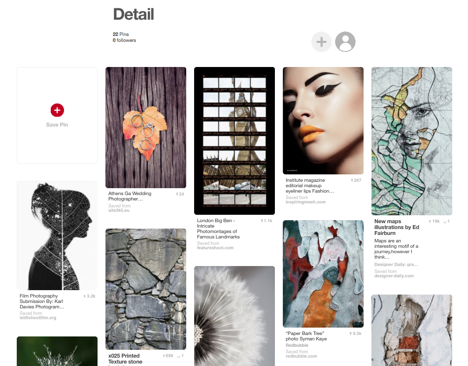
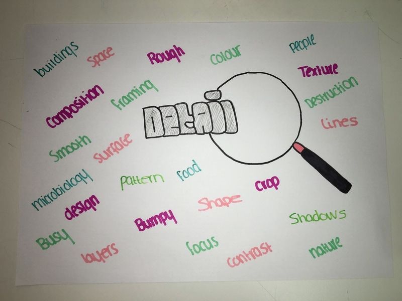
Theme: Detail
Reason For Choosing Detail:
I chose 'detail' as you can take this theme and interpret it in any way you wish. There are many different ways you can explore and display this theme due to its varied aspects. I also feel there will be many techniques I can explore with throughout, in order to see which one works best for my final piece. Many photographers have explored detail, using great use of lighting, background and focus. For example Jo Whaley, Henry Troup and Phil Straus.
|
|
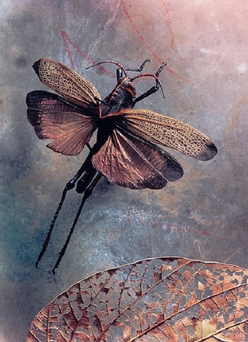
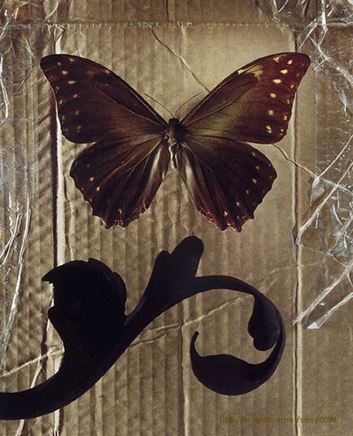
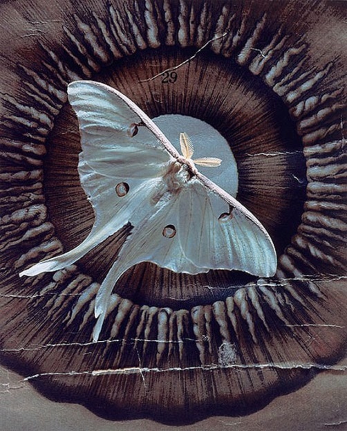
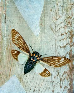
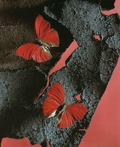
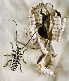
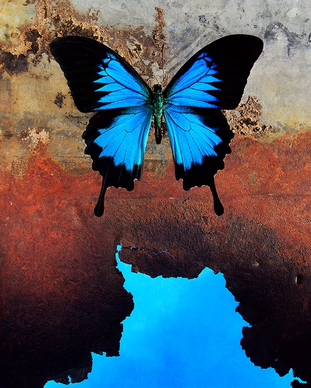
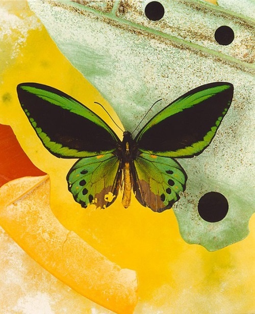
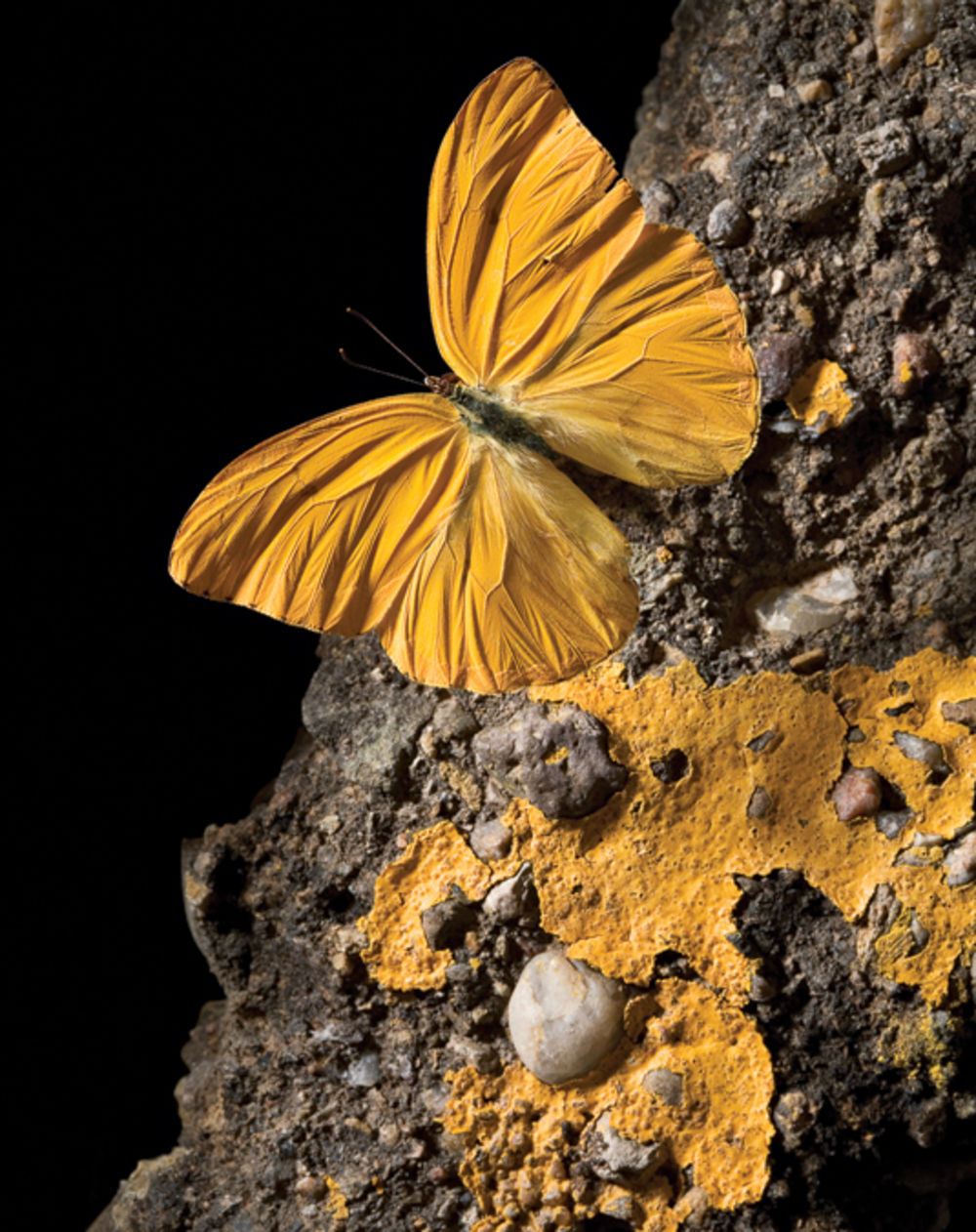
Jo WhaleyJo Whaley is a famous artistic photographer. She is known to create photographs of insects whilst blending natural history with environmental concerns. She also makes still life photographs of natural elements, such as fruits, vegetables and flowers. Jo Whaley has infused her images with the illusionary world of the theatre. She is also known for her detailed photographs that include a great use of colour as well as combining photography work with paintings.
These are some images produced by Jo Whaley herself. I specifically like her use of vibrant colour. For most of her images she carries this technique for each. For example the images I have researched all contain great use of bold colour. I also like how the colour makes the image stand out when the subject is behind a dark background. In this case the main objects seem to be insects such as butterflies and beatles. The photographer also seems to use backgrounds that include a lot of texture and tone. For example these images tend to have quite a rough background as well as bumpy. Furthermore she uses mainly dark tones and shadows to create the outstanding backgrounds.
My favourite image made by Jo Whaley has to be the 1st. In this image I noticed she had placed a dragon fly and leaf onto a textured surface. I like how dark the dragon fly appears to the eye. This enhances all the features on the fly and the surface has marble effects which creates an illusion of brightness. |
Inside Surfaces |
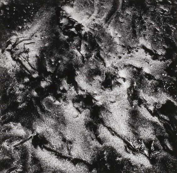
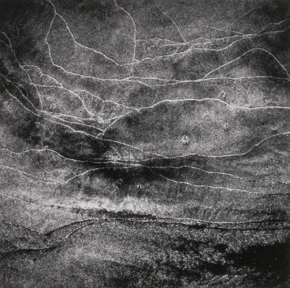
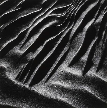
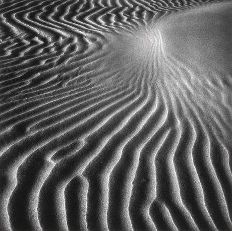
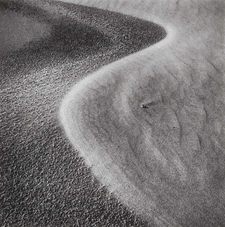
Henry TroupHenry Troup is a famous photographer known for making excellent portrait photography. He also pursued fine art image making and printing. Most of his photographs consisted of abstract patterns of sand and beaches. His quiet demeanour and insights to image making were unique and fascinated many people.
These are images made by Henry Troup himself. I specifically like how he increases the contrast in each image.This enables us to notice the different textures, as the blacks are very dark and the whites are very bright giving astonishing dimension to the images. . Furthermore I like how abstract his images appear to be. As you can interpret the image in any way you wish. No image looks just like sand. He has got close to the surface and captured various lines and shapes in order to make the image stand out to be an abstract photograph.
My favourite image made by Henry Troup has to 3rd. This is one of my favourites because he has interpreted the theme detail by making the image very abstract. I like how there is a clear view of destruction between the different lines and shapes. I also like the different shading between the colours which creates a beautiful contrast between them. As well, I like how their seems to be a high desnsity within the image. |
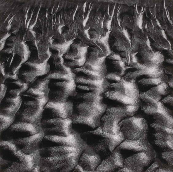
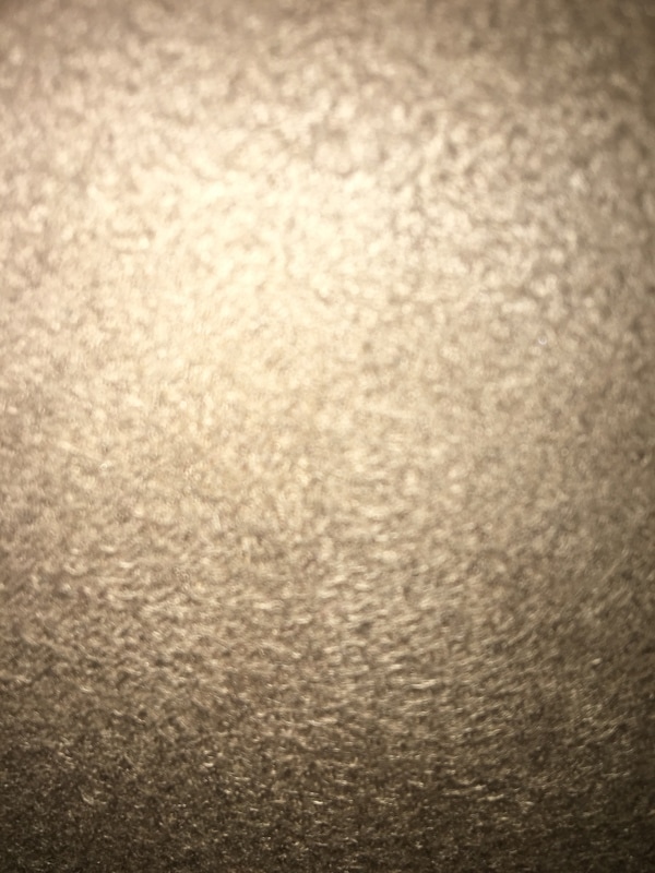
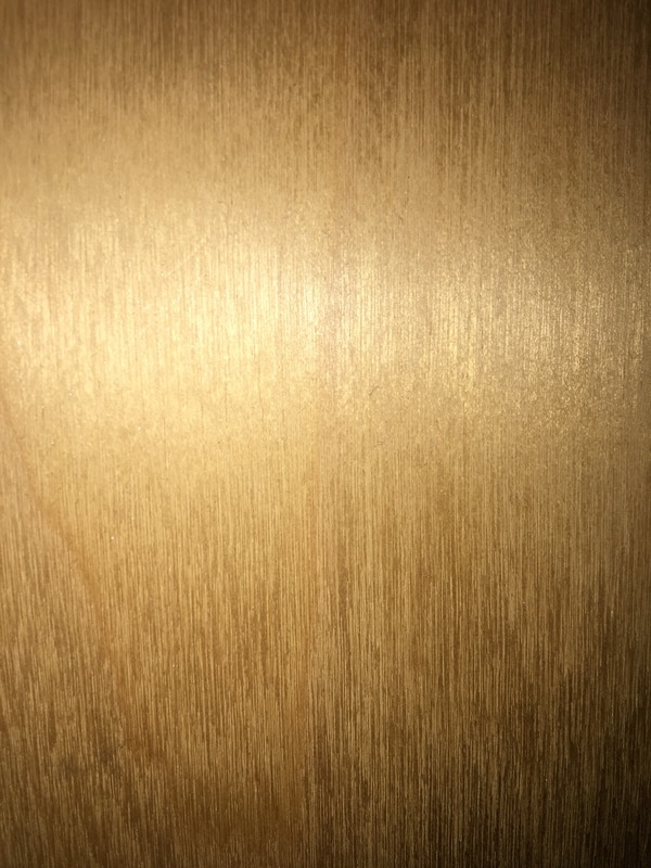
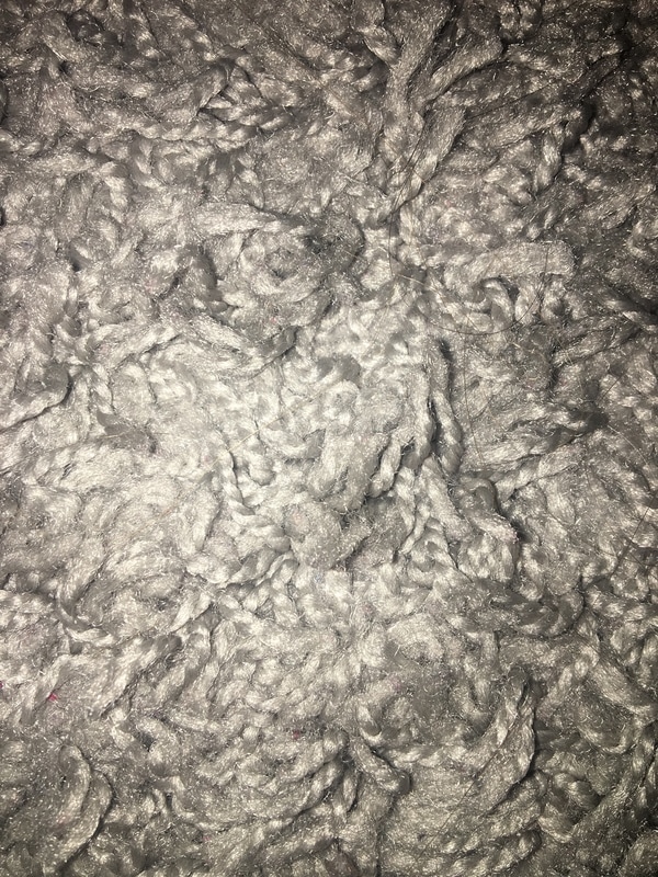
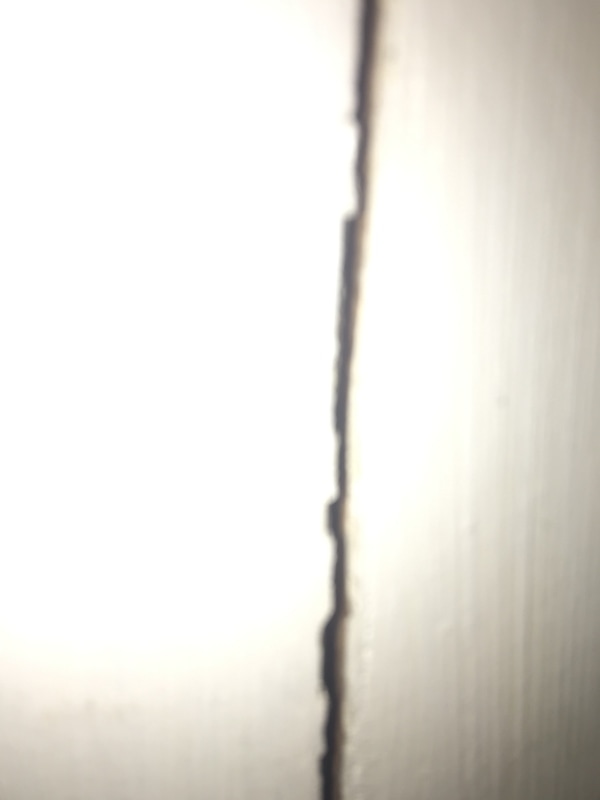
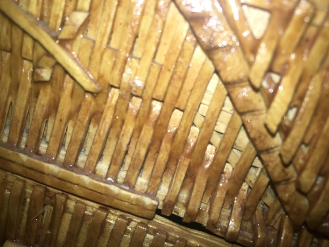
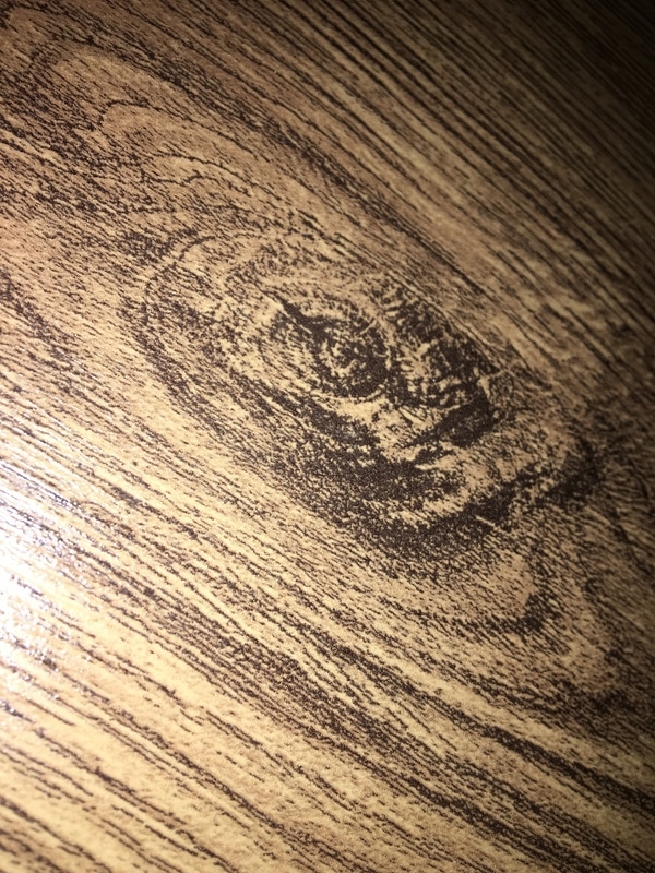
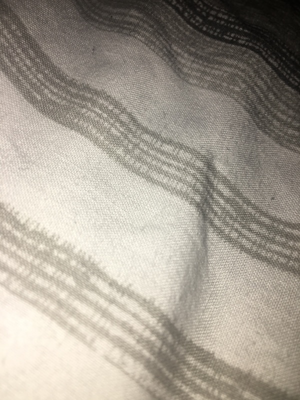
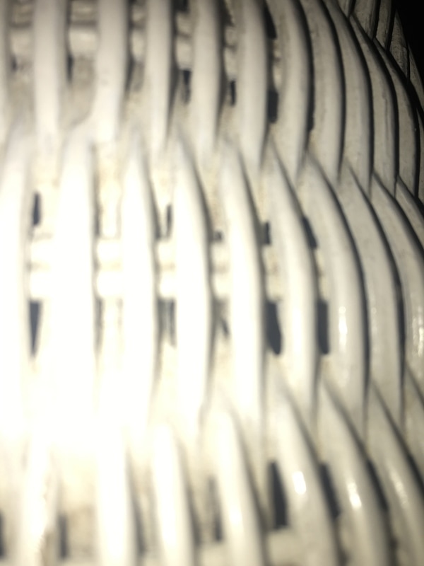
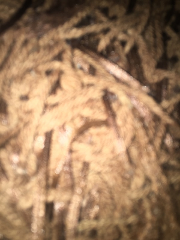
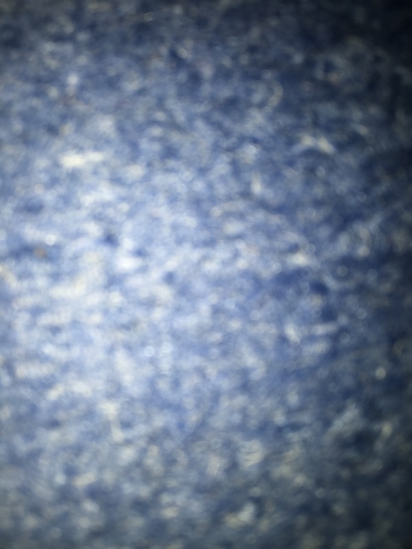
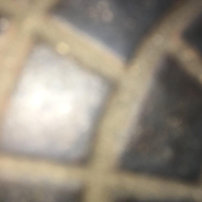
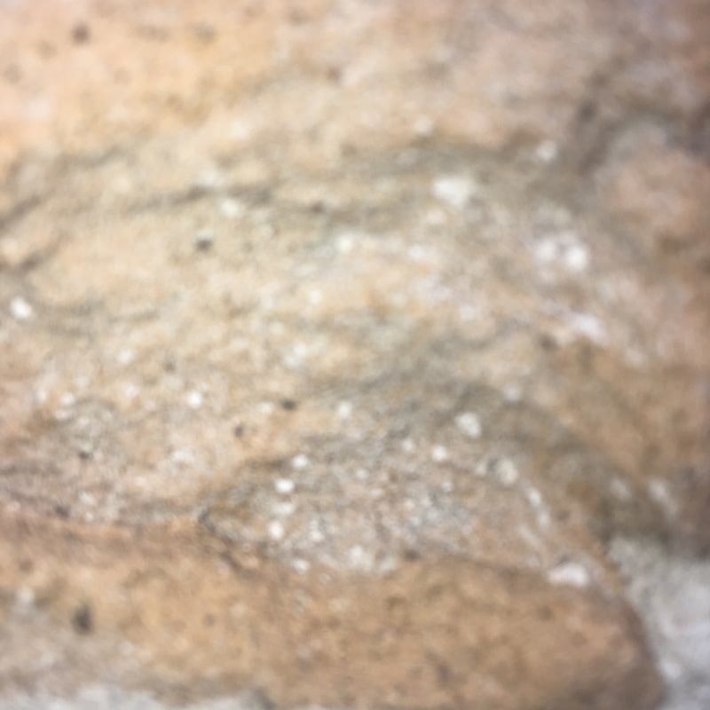
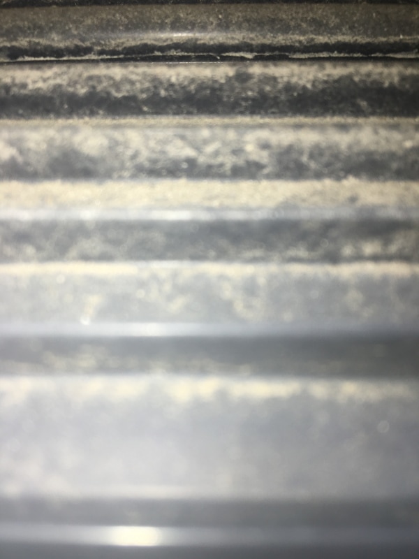
Through this process I have managed to photograph different textured surfaces inside of my home. I done this in order to explore the different forms of surfaces that could help me with my final piece. Here I have tried to get very close to the surface in order to create an abstract theme. This creates various illusions to the eye as you can not be sure of what they are from.
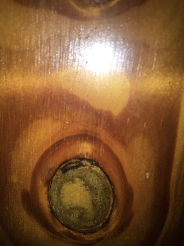
My favourite textured background is the 5th image. Here I have photographed a fragment of some wooden draws in my house. However, to make it more interesting I have got very close to the surface area. I did this to yet again make the viewer unsure of what they are seeing. I also like the different tones in the wood. The dark browns and very light browns create a distinctive look.
My favourite textured background is the 5th image. Here I have photographed a fragment of some wooden draws in my house. However, to make it more interesting I have got very close to the surface area. I did this to yet again make the viewer unsure of what they are seeing. I also like the different tones in the wood. The dark browns and very light browns create a distinctive look.
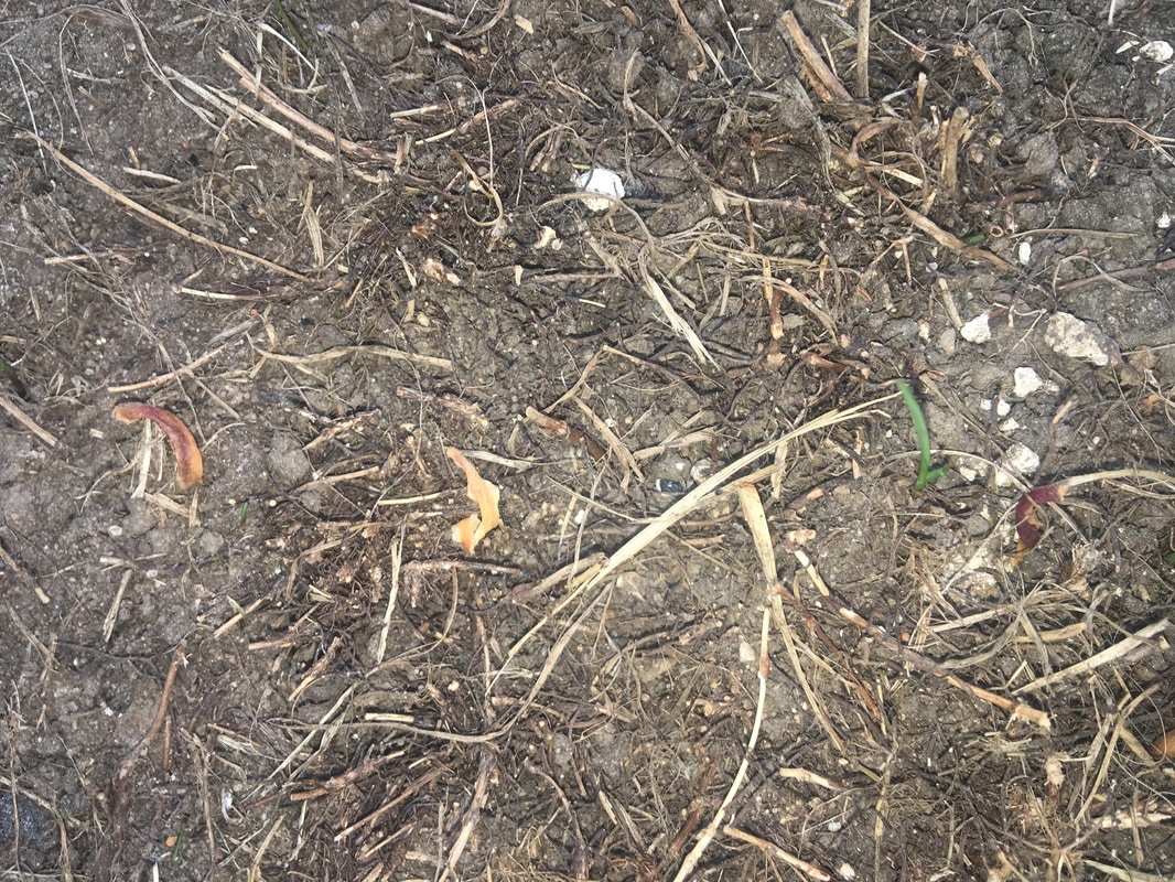
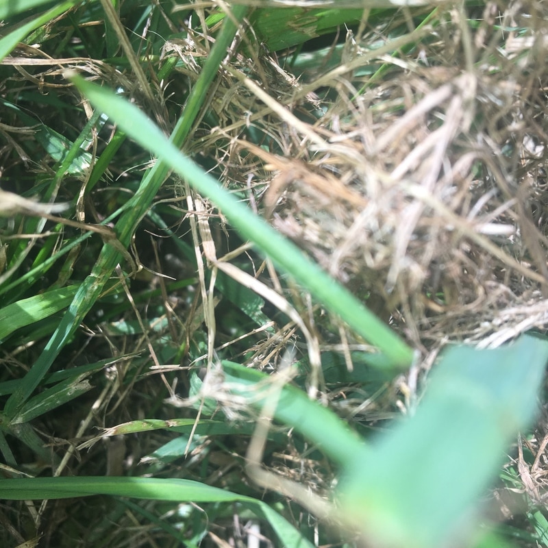
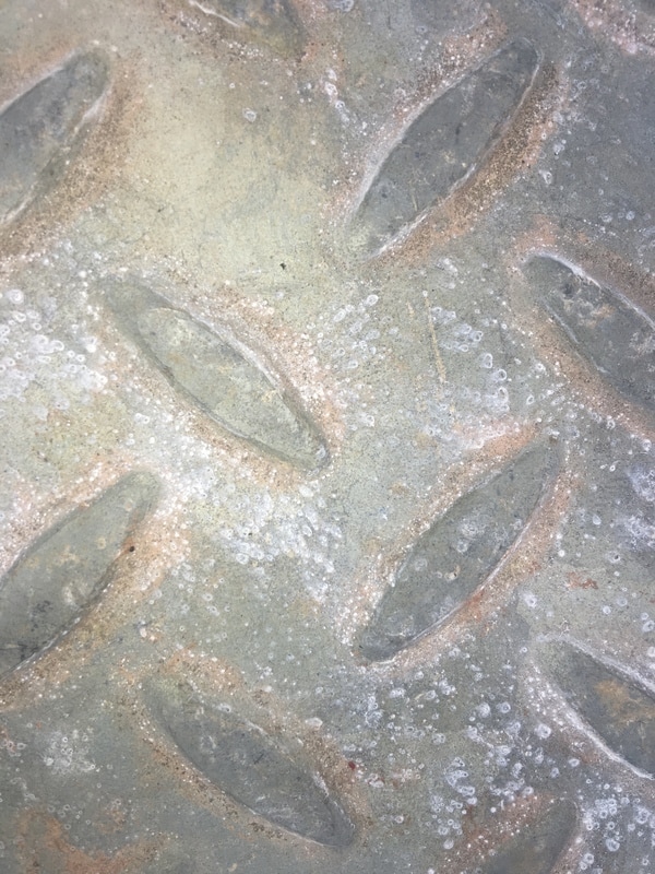
Outside Surfaces
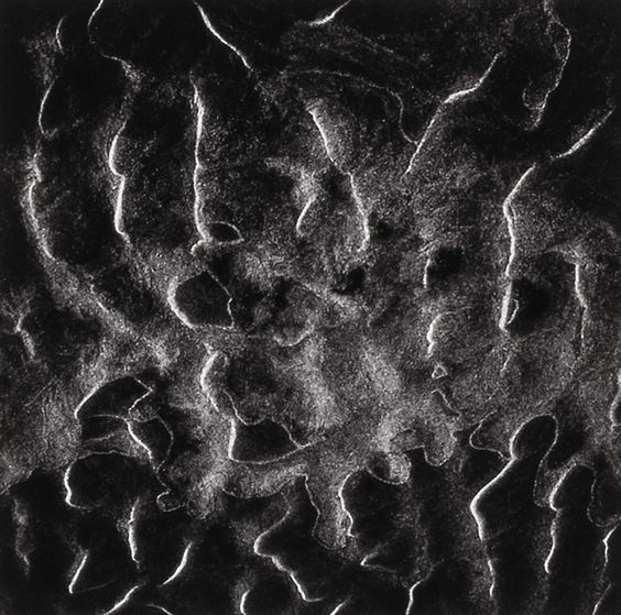
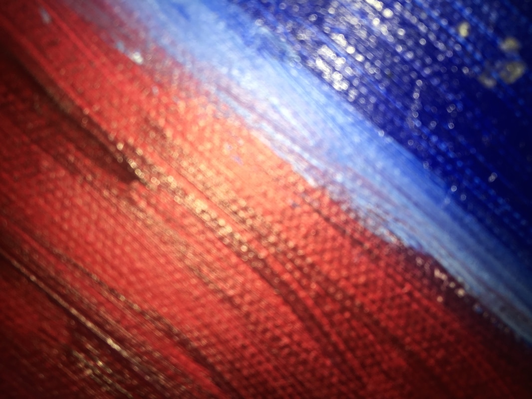
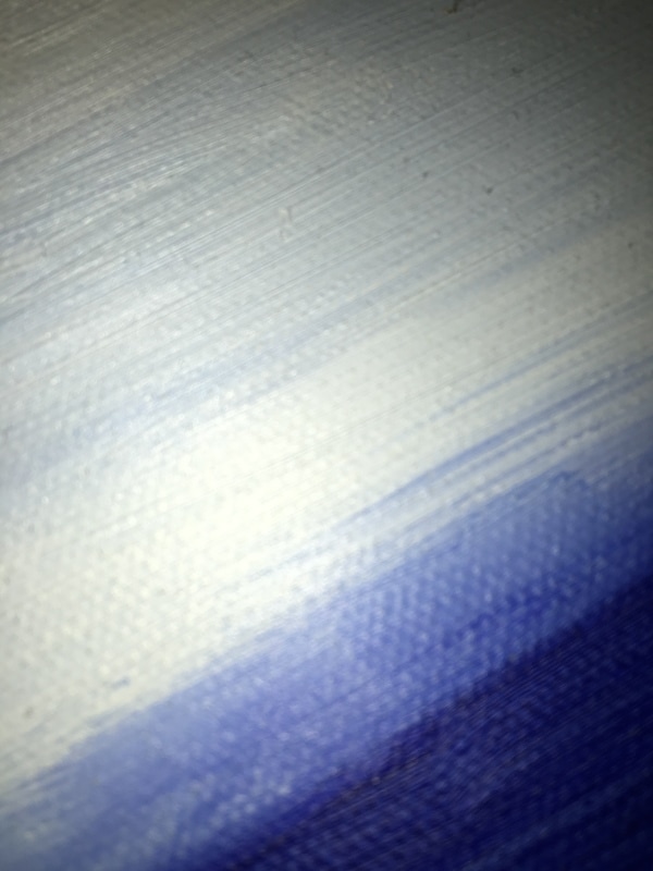
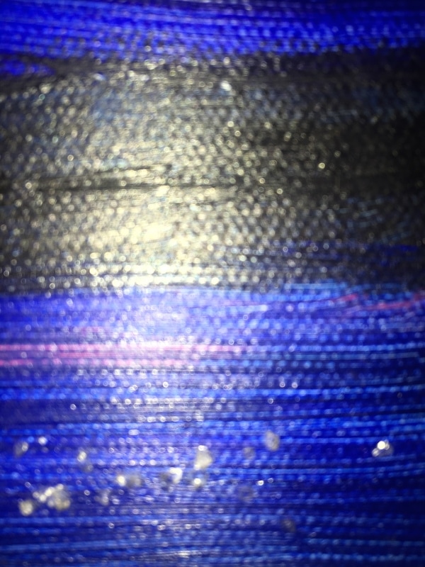
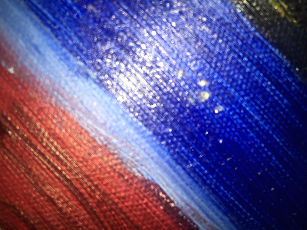
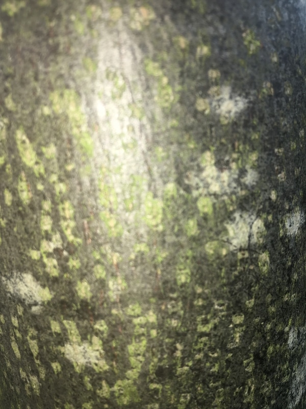
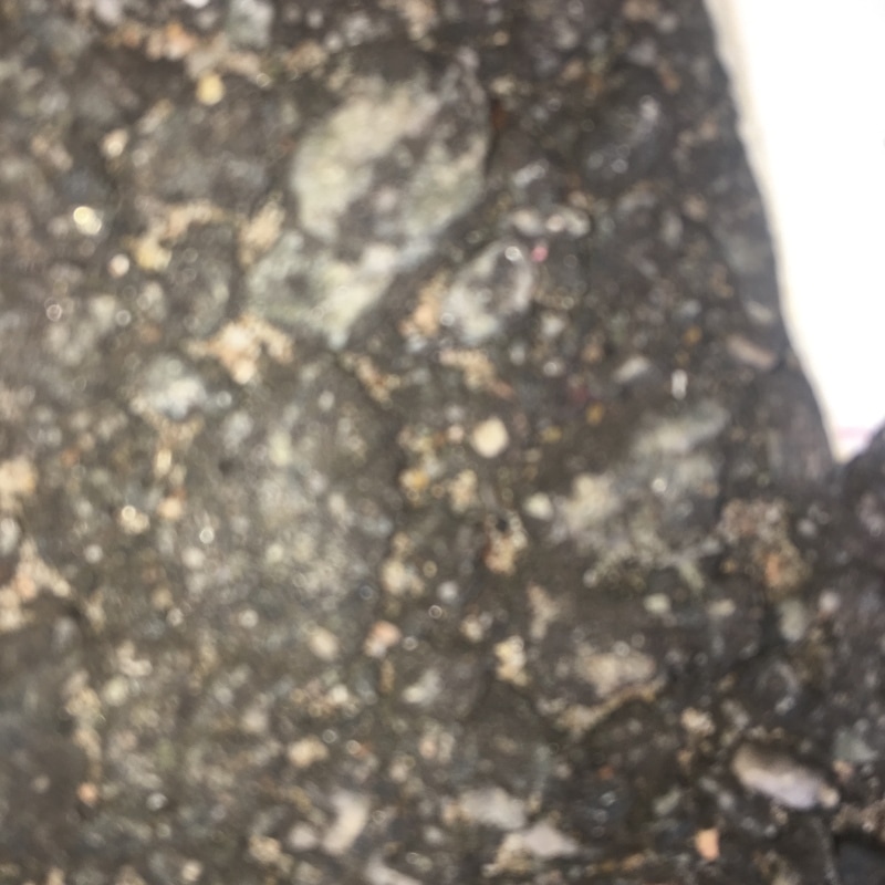
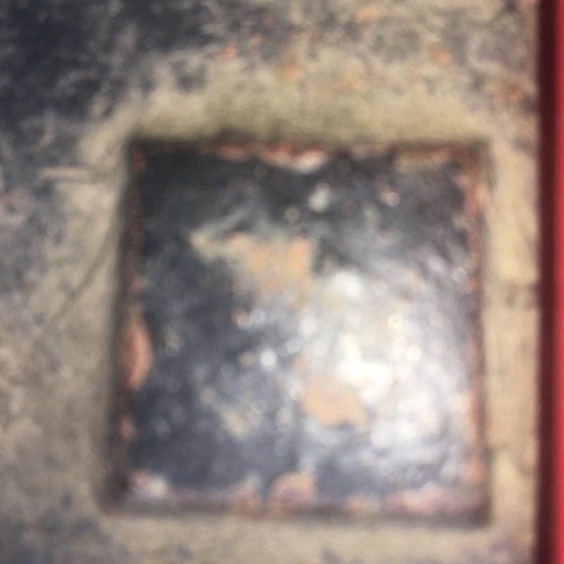
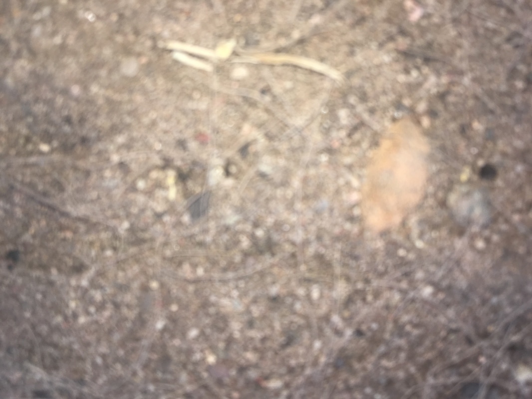
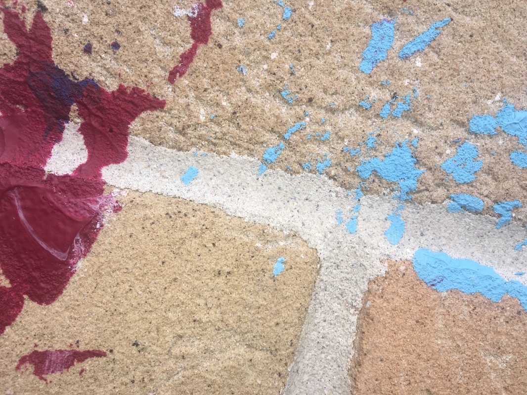
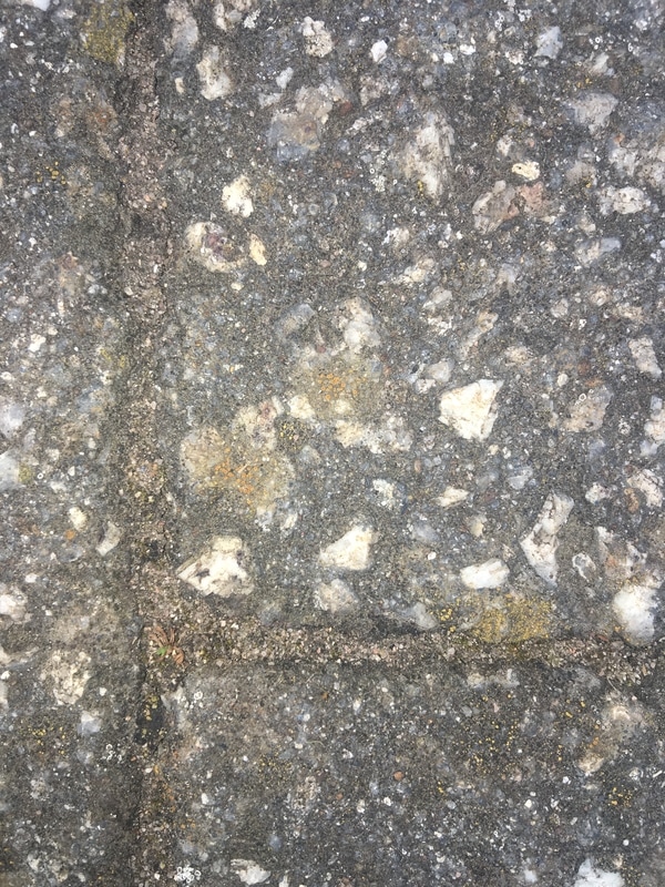
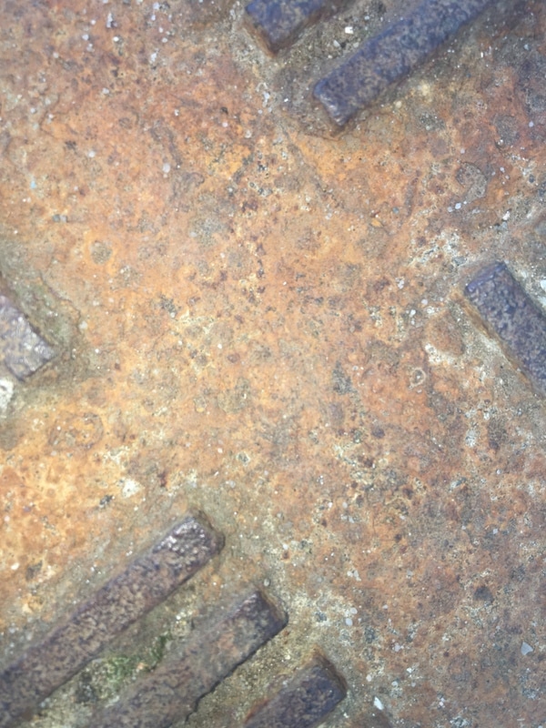
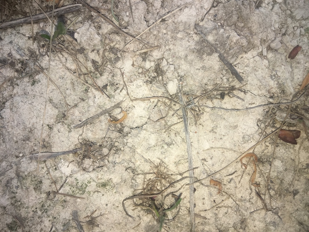
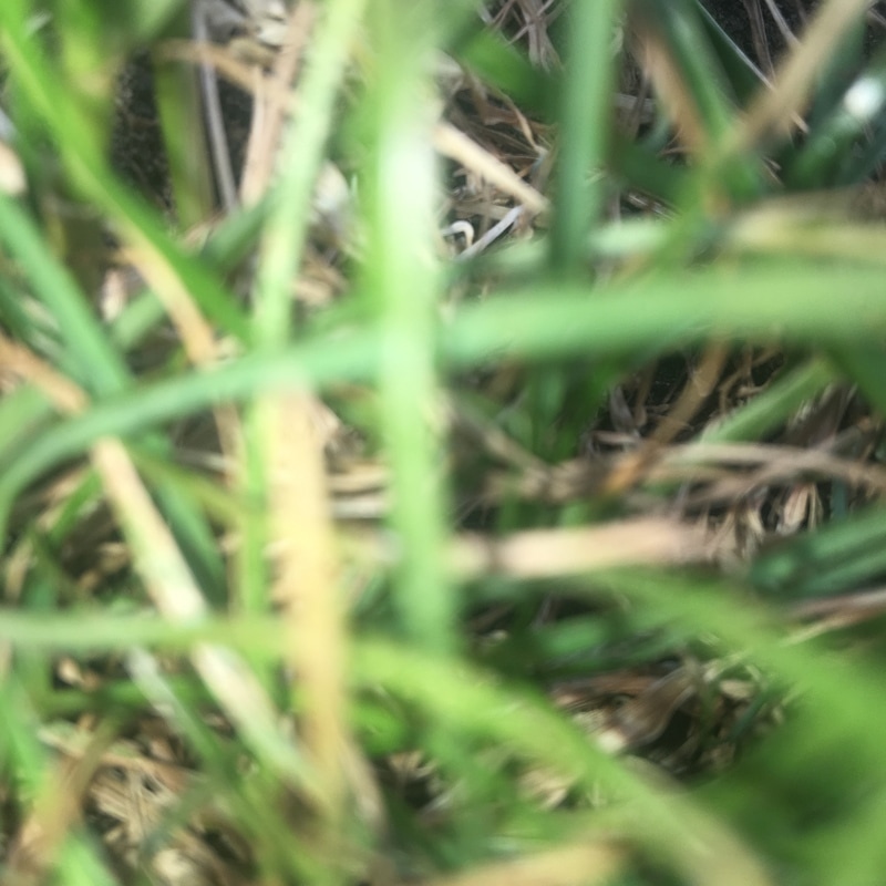
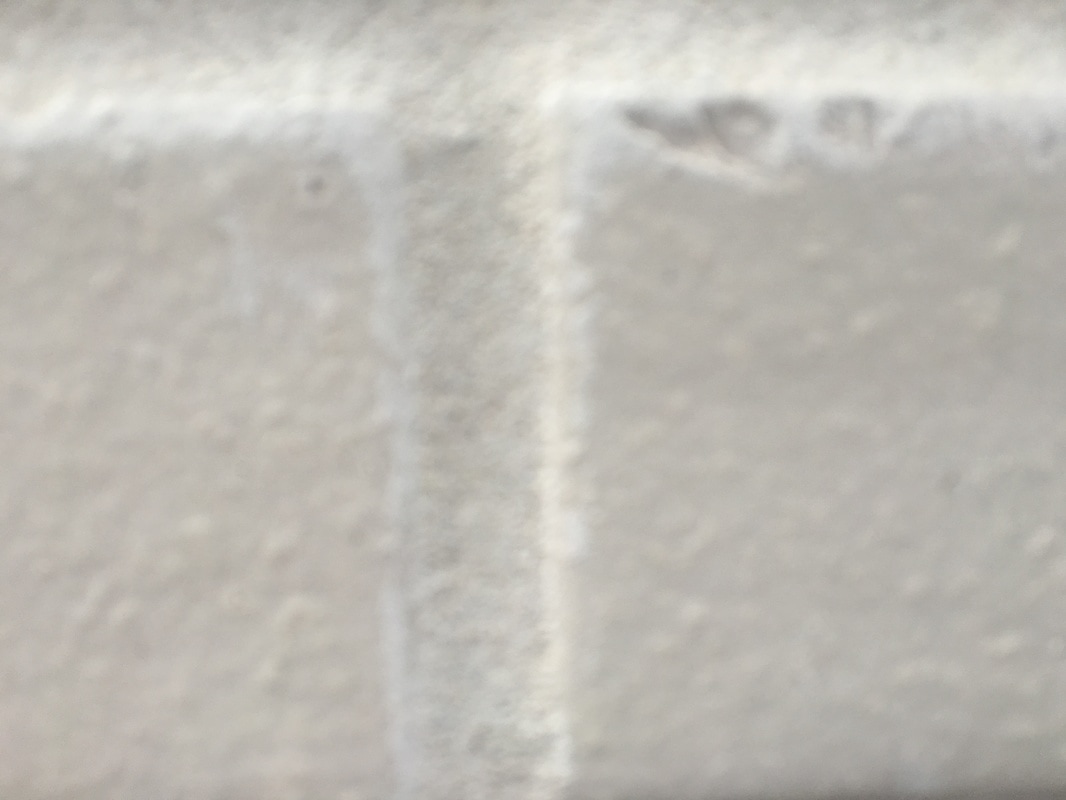
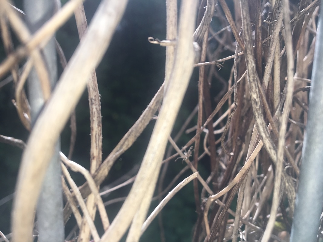
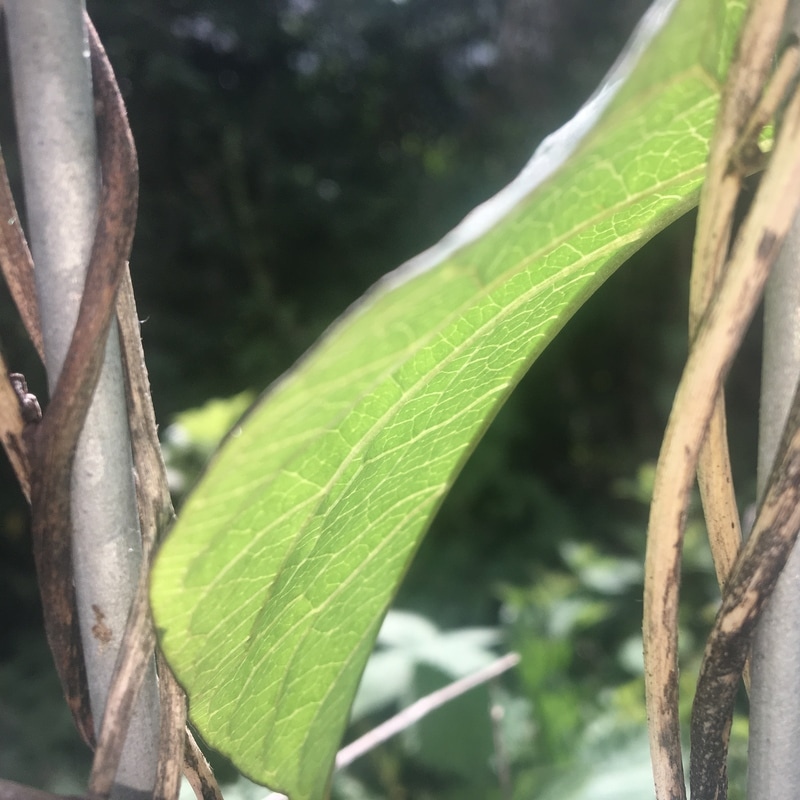
Through this process I have also managed to photograph some outside surface areas. I done this to explore the varied surface textures. Here I have also chosen to get very close to the surface in order to create that same abstract effect. Throughout this experiment I was looking for interesting surfaces that have different patterns and edges.
My favourite textured surface area is image 8 purely because I like the splash of colour. This adds some life into the image of the boring wall. I also like how bumpy and rough the texture of it appears, which makes it stand out. However next time I would like to put the image into photoshop and change the brick wall into black and white to make the different tones stand out. However, I would keep the splash of paint in colour to create a dramatic look.
My favourite textured surface area is image 8 purely because I like the splash of colour. This adds some life into the image of the boring wall. I also like how bumpy and rough the texture of it appears, which makes it stand out. However next time I would like to put the image into photoshop and change the brick wall into black and white to make the different tones stand out. However, I would keep the splash of paint in colour to create a dramatic look.
Photoshop Process
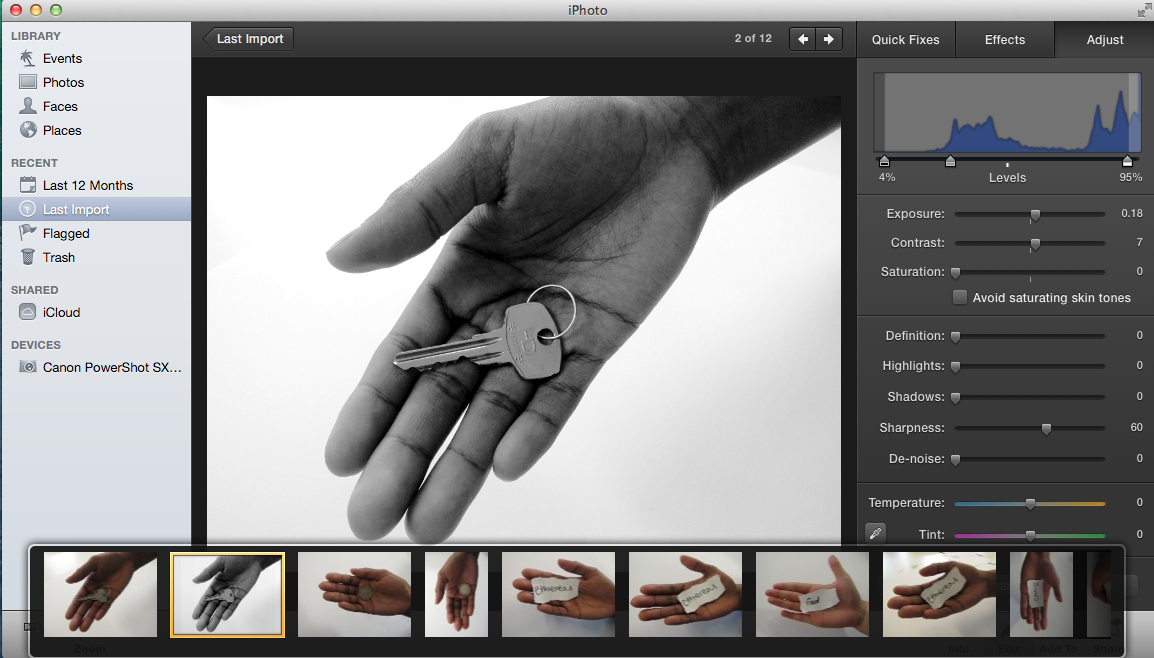
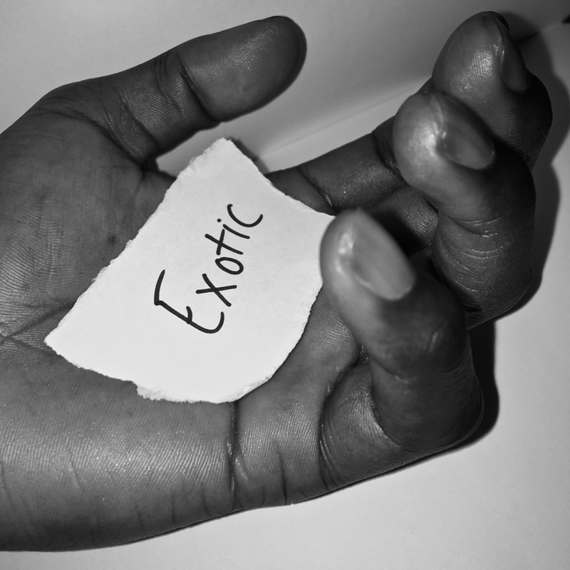
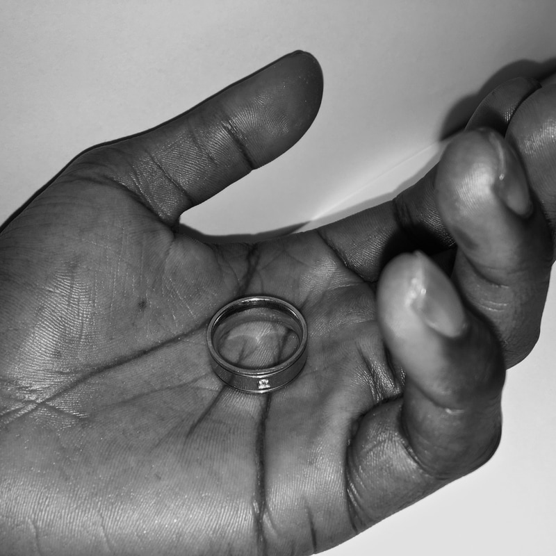
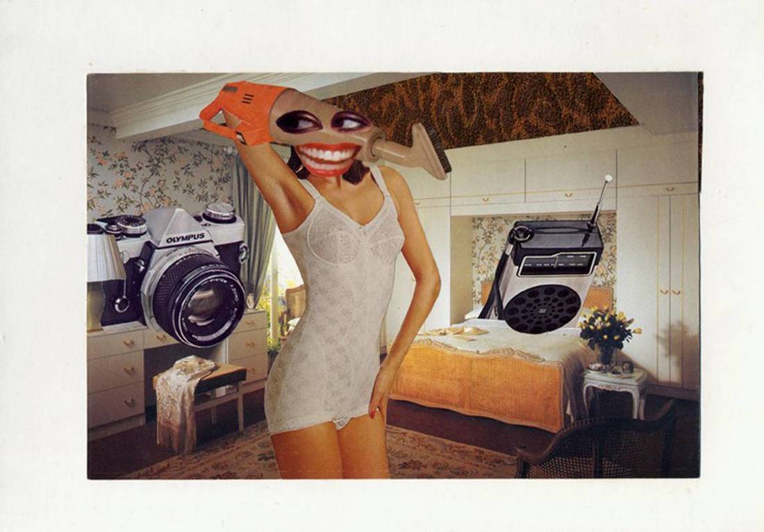
Here is my first idea inspired by artists named Joe Whaley and Henry Troup. However here I have created my own affect by placing objects within the palm. I asked people to take out the first thing they feel in their pockets. This helped me interpret the theme detail, as everyone chose different things. I then explored the idea even further by allowing the individuals to write the first word that came into their head on paper. To then place it within their palm. Throughout this idea I tried to interpret text as I liked the thought of a piece of text layered on top of a simple hand.
After gathering a range of pictures inspired by the theme detail, I then put the images into photoshop. For some of the pictures I changed them to black and white. I done this to enhance the varied tones and to emphasise the range of texture within the palm. I also made sure the background was a clear, white background. I done this to allow the hand to be the main focus in this picture, as I didn't want anything else interfering. I then created a faded affect around the hand. I done this to draw attention to the shape of the hand and all the detail that occurs.
After gathering a range of pictures inspired by the theme detail, I then put the images into photoshop. For some of the pictures I changed them to black and white. I done this to enhance the varied tones and to emphasise the range of texture within the palm. I also made sure the background was a clear, white background. I done this to allow the hand to be the main focus in this picture, as I didn't want anything else interfering. I then created a faded affect around the hand. I done this to draw attention to the shape of the hand and all the detail that occurs.
|
|
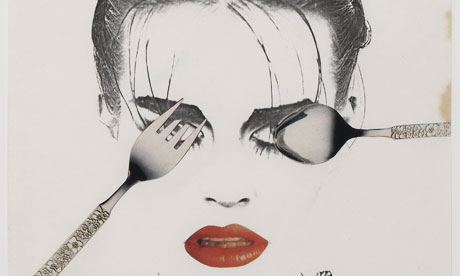
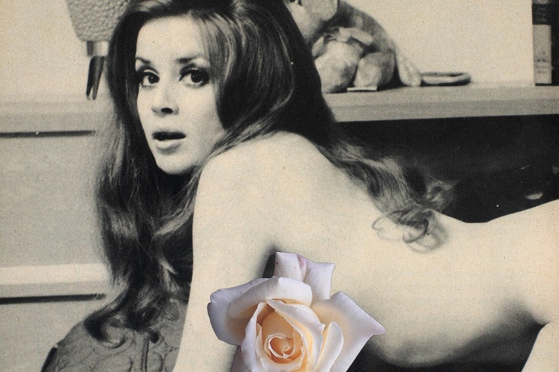
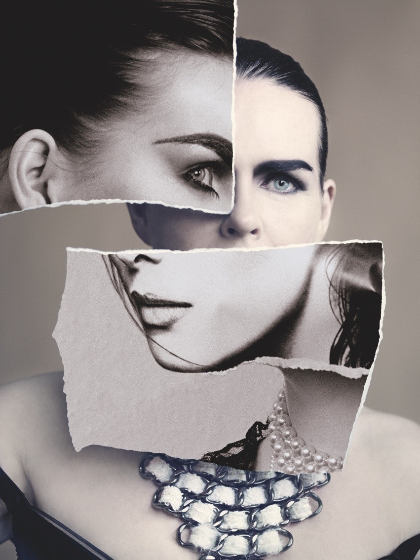
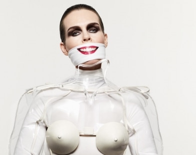
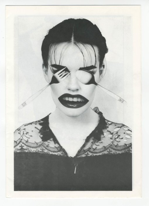
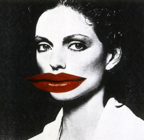
Lisa LinderLisa Linder is a famous photographer who is also a feminist. She interprets her views within her work. She believed women were seen as objects and tried to show this through her amazing artwork.
When looking at Linder's photography you are straight away drawn into the way she adds cut outs and places them over specific features of a woman. This is effective as she |
|
|
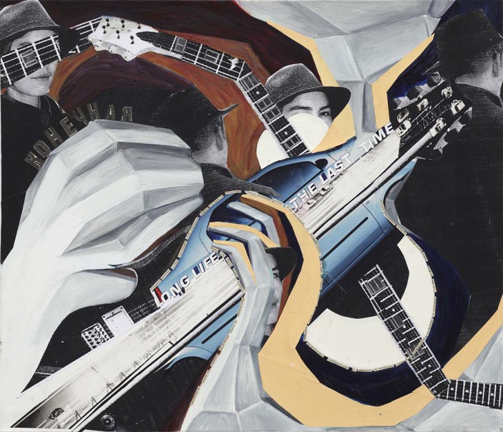
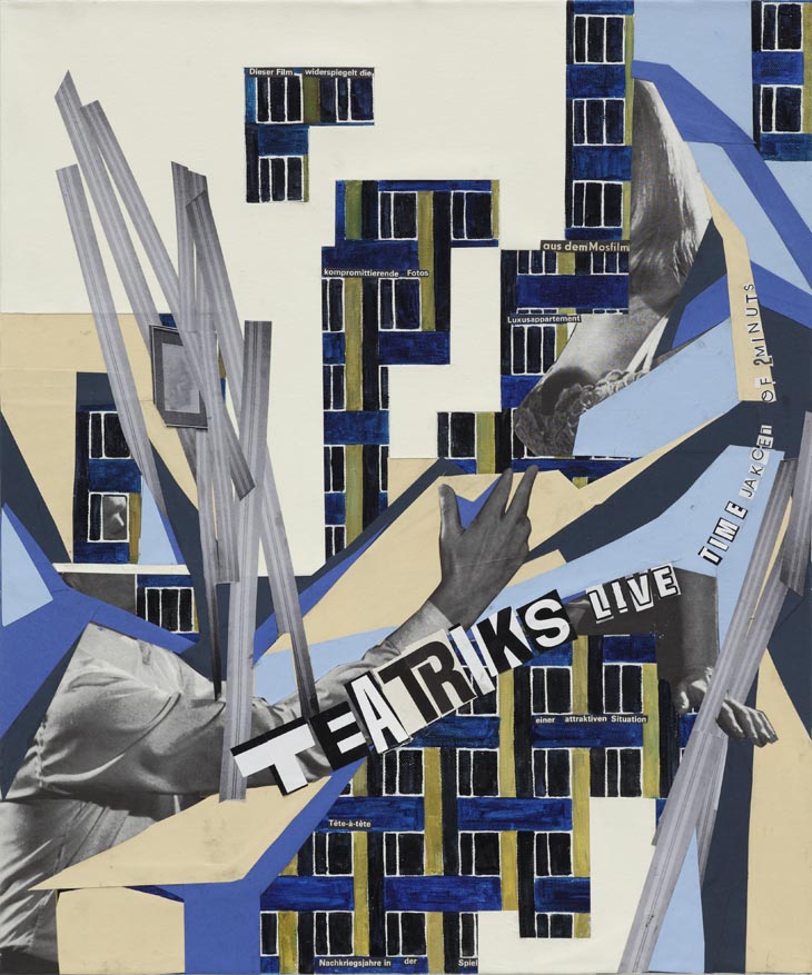
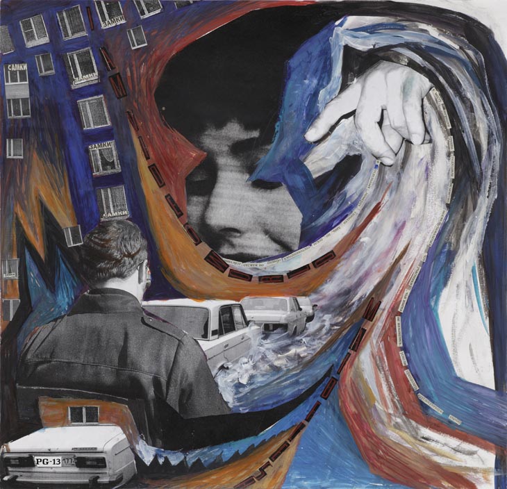
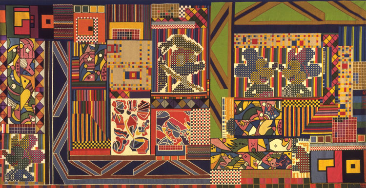
Anna Parkina
Anna Parkina is a well known photographer who creates images by merging different textured objects and surfaces to create astonishing collages. Parkina specifically focused on Russian culture and society, she explored this through involving both past and present images. She distinctively used a bold colour palette as well as abstract shapes.
Here is a selection of Anna Parkina's photographs. Straight away I notice how extradinary her images appear to be. She uses various parts of text as well as unusual patterns and prints. I can also see how she emurges facial expressions into some of her work creating a distinctive look. I specifically notice how she includes a range of different lines which give a 3D affect within the pictures. She also includes numerous textures. My favourite image made by Anna Parkina has to be the 4th image. I like how she has interpreted text into her image. This visial information has created meaning to the photograph. I also like how she has captured a very abstract looking building and placed it underneath everything else. This adds definiton to the image. Another favourite of mine is the 8th image due to its representation of culture. Parkina has done this by emerging different surfaces and human portraits. I also like her use of colour. She has kept the palette quite simple but added hints of green to brighten up the image. One of my least favourites has to be the 1st image. I don't feel as though it is abstract enough, compared to the others. To improve this photo Parkina could have added more vibrant colour in order to highlight parts that are more important. She could have also got closer to the subject in order to make the image more abstract. |

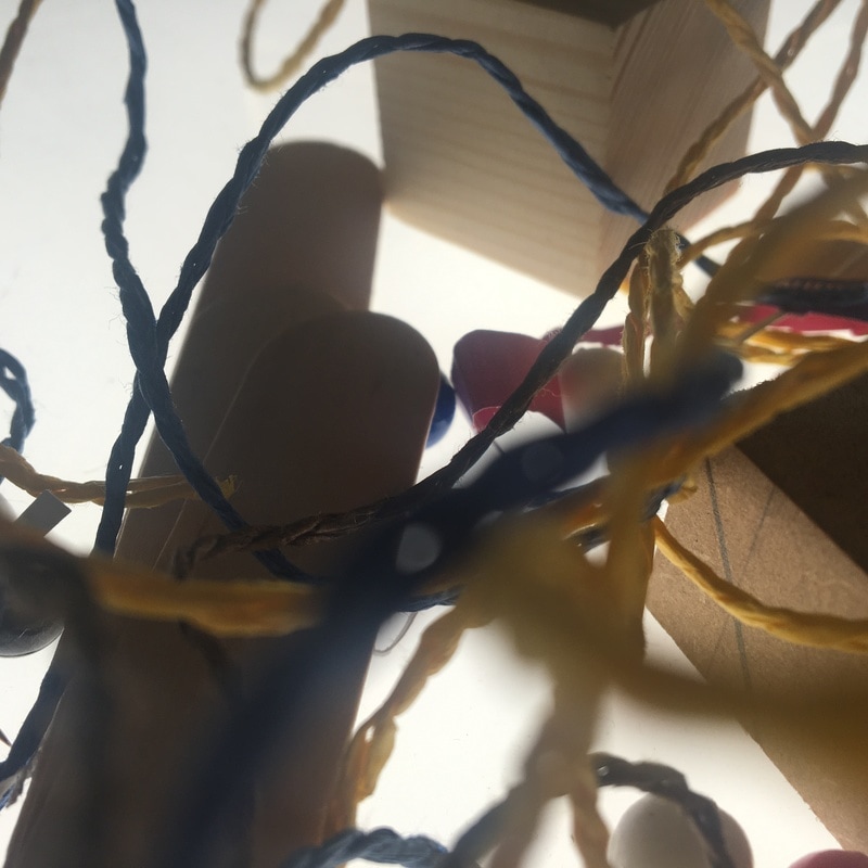
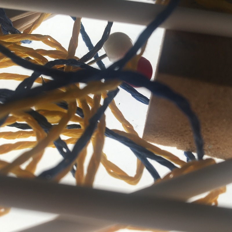
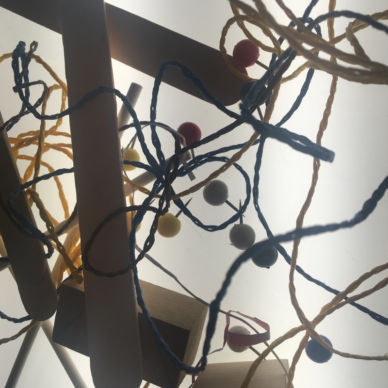
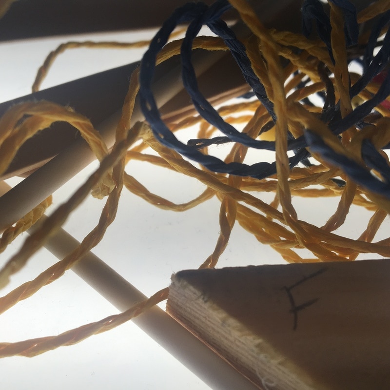
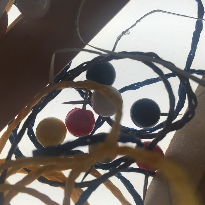
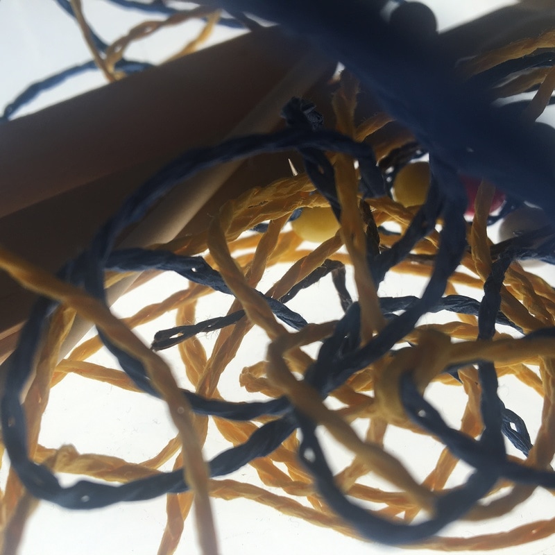
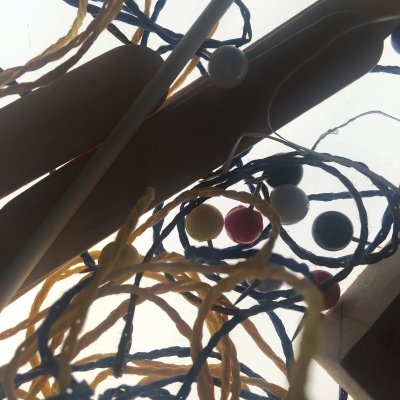
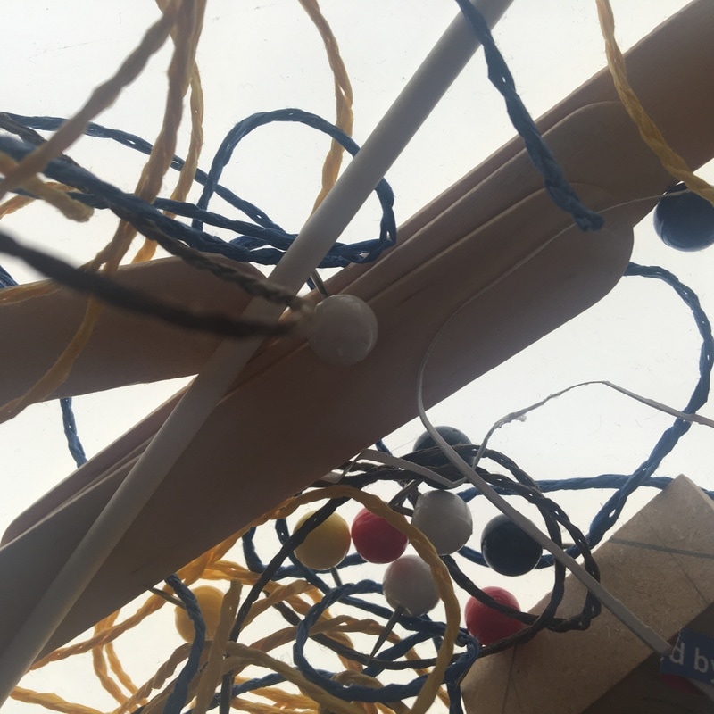
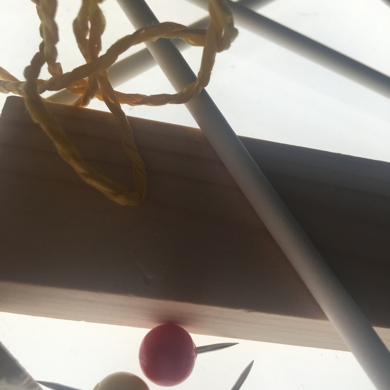
My Lightbox Images
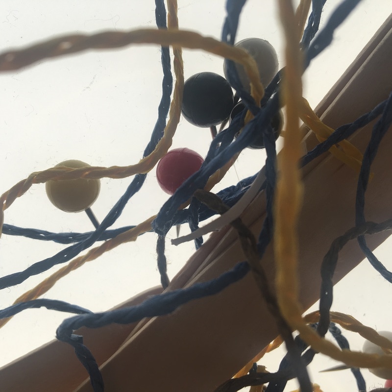
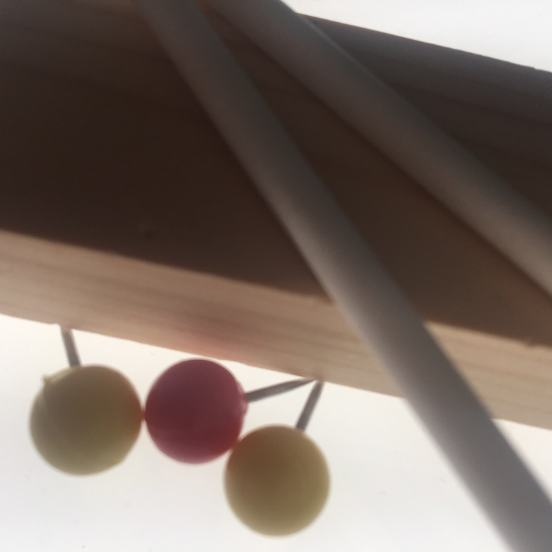
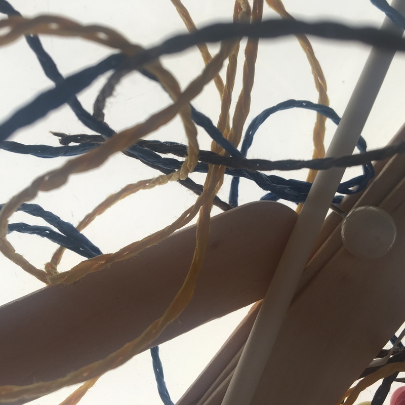
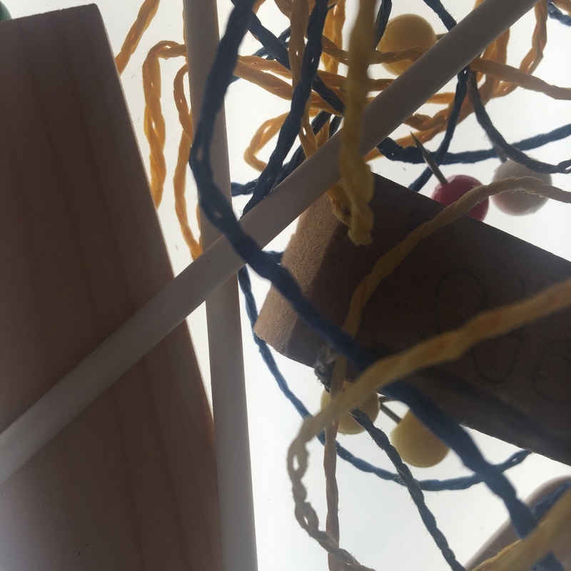
Here I have used the light box and random objects in order to create some abstract images. Firstly I gathered different edged/ lined and patterned objects. I then placed them onto the light box playing around with the arrangements. After that I photographed the objects from different angles to make them look unique. After that I decided I wanted some of them in focus and some not to create a blurred look.

|
|
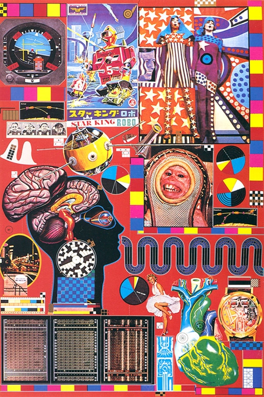
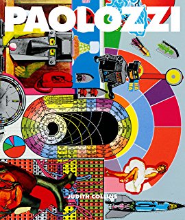
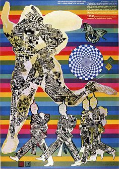
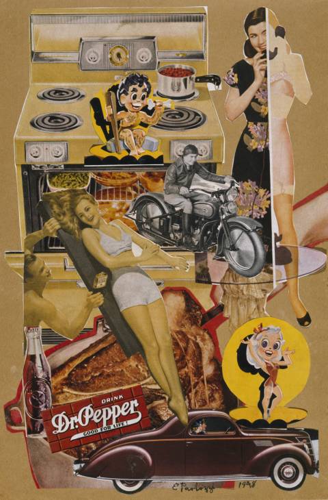
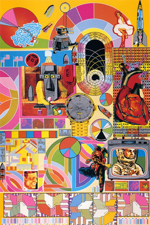
Eduardo Paolozzi
Eduardo Paolozzi was a scottish sculptor and artist. He is widely considered to be one of the pioneers of pop art. Paolozzi was interested in everything and would use a variety of objects and materials in his work, particulary collages.
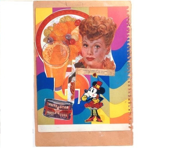
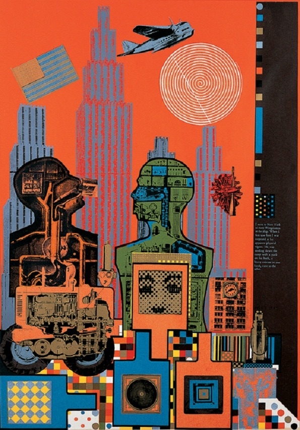
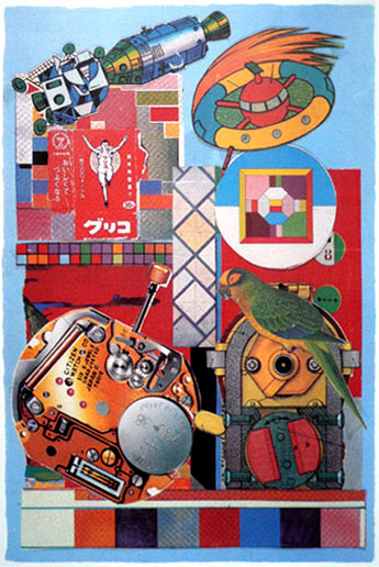
Here is some of Paolozzi's art work. When I look at his images I find it hard to focus on one thing purely because there seems to be so much detail. He uses bold colours to make his collages stand out which I adore. His art work also involves a lot of patterns and abstract shapes that tie the pictures together. I also noticed he doesn't include white space/backgrounds, he mainly focus's on filling up the space with vibrant coloured images. My favourite image made by Paolozzi has to be the 4th image. This is because I like how he includes a lot of different images thst seem to have dfferent viewpoints when taken. I like how he emurges them together and focus's on composition throughout. As well, I adore how he has stuck with bold colours which has worked as a great technique to lighten up the images as well as surroundings. |
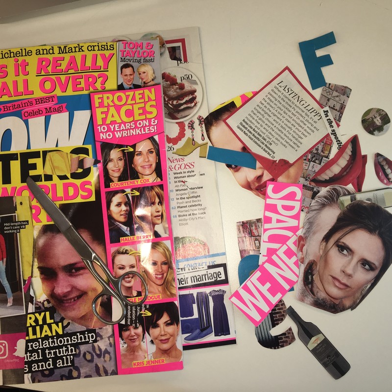
Prep For Photograms
As you can see here I have taken magazines and cut out certain parts. I done this because I wanted to take a range of images then re arrange them to make my own photograms. I specifically chose faces, text and mouths because I thought they would create some distinctive images that relate to my theme 'detail'.
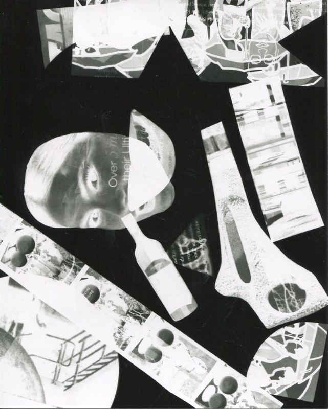
First Set Of Photograms
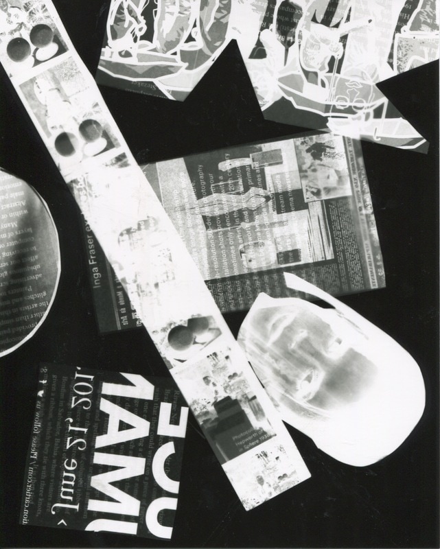
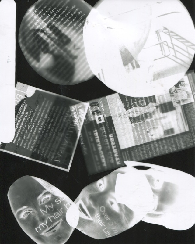
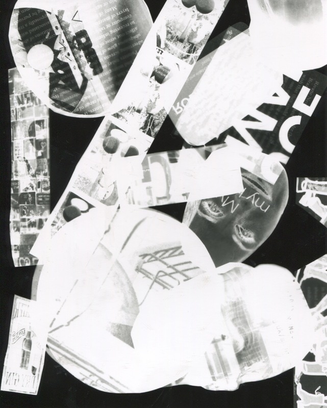
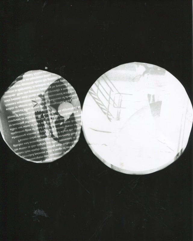
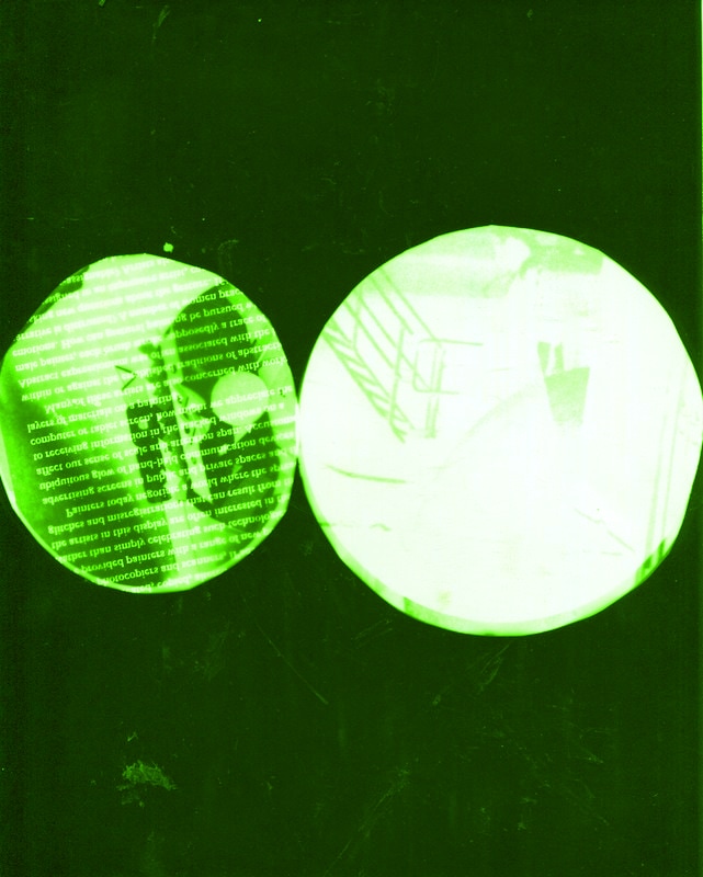
Here I have experimented by making photograms using cut outs from magazines. In order to make this work, It took some time re arranging the different images onto the light sensitive paper. The layout was very important as I was trying to achieve an almost blended, spooky look. My focus was also overlapping some of the images, because I wanted everything to be connected. At first it was very hard to achieve the perfect toned photogram, as my first photogram wasn't exposed to the light long enough. However I improved this by trying different times in order to achieve the one I wanted. Eventually I managed to get the right amount of exposure and created some amazing photograms. I like these set of images as they all have similar features


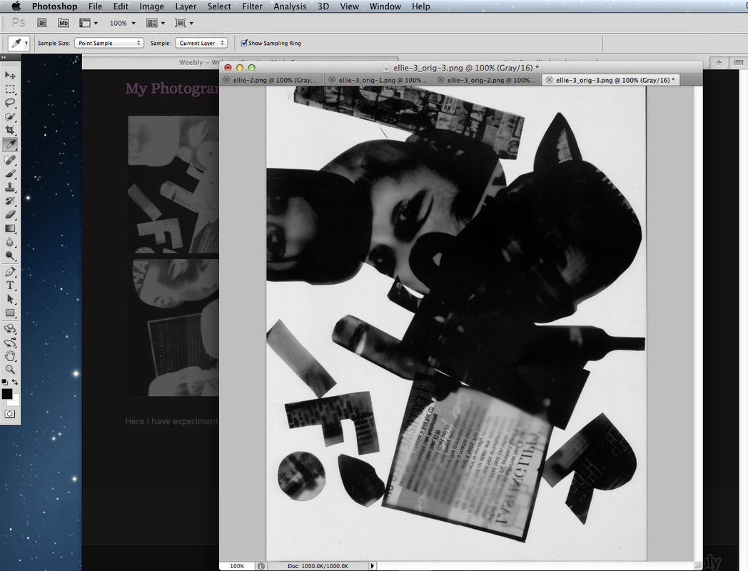
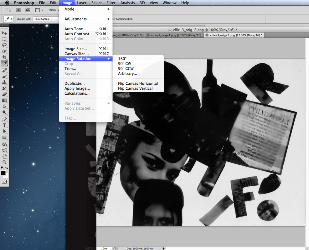
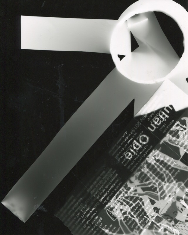
Invert And Rotate Process
This is specifically how I inverted and rotated my images in photoshop to correct the negative space as well as changing the image from a portrait to a landscape.
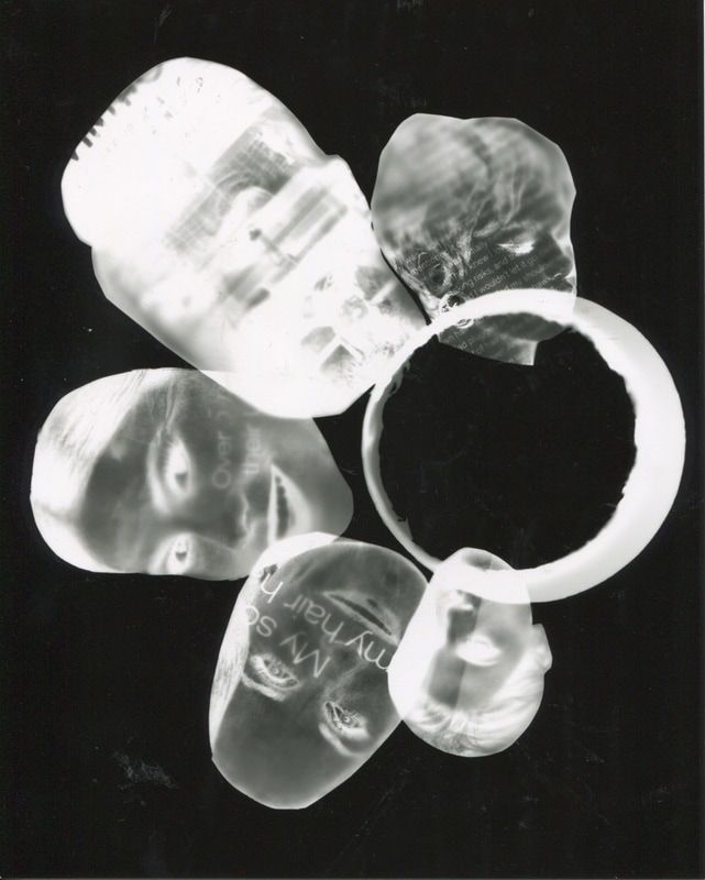
New And Improved
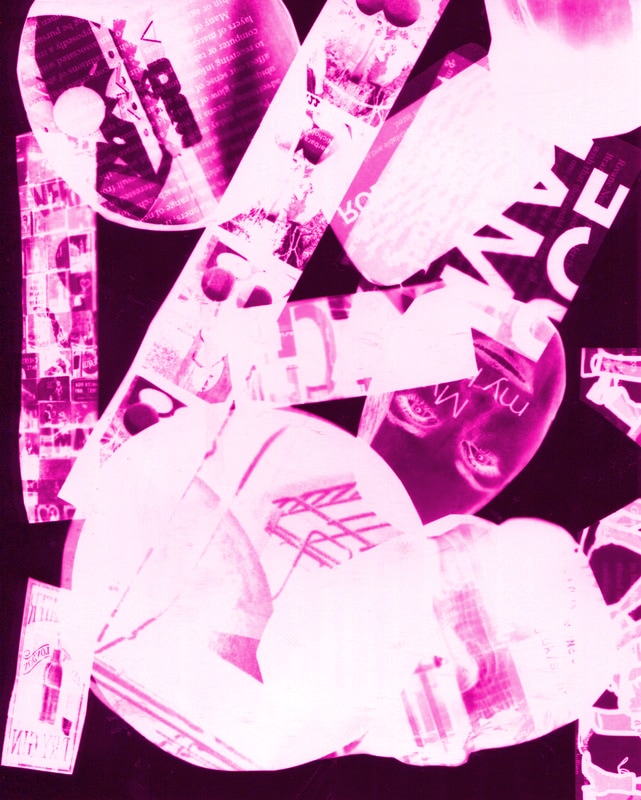
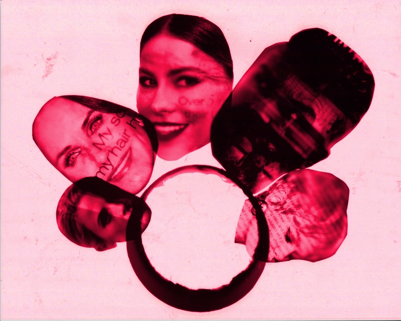
Here I have developed my idea by putting my images into photoshop and created inverted/rotated versions of the photograms. The inverting method has made the images change from a negative to a positive. I done this to make the photograms appear clearer. This also increased the vision of all the small details. As well as making the background go from black to white which I liked as I felt there was more of a contrasty effect, after doing this.


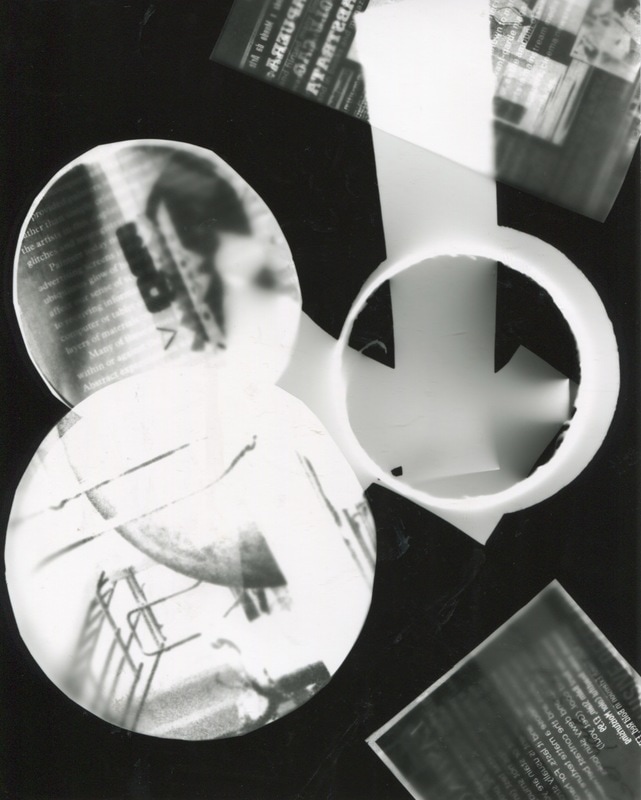
Second Set Of Photograms
Here I have taken a second set of photograms to improve as by this point I had understood exactly what I wanted from making these set of images. I done this so I had a variety of effective images to choose from. Here I have added a lot more text and changed some of the shapes, so all of the pieces weren't the same. I experimented by using different sized shapes as well as adding geometric shapes.
Photograms Taken Into Photoshop
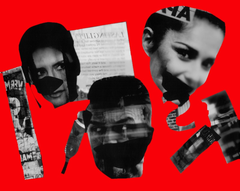
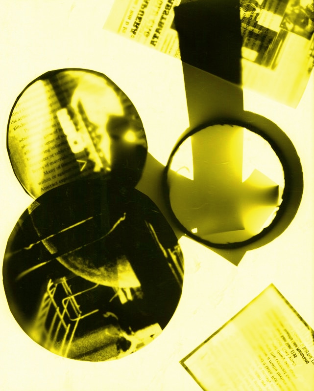
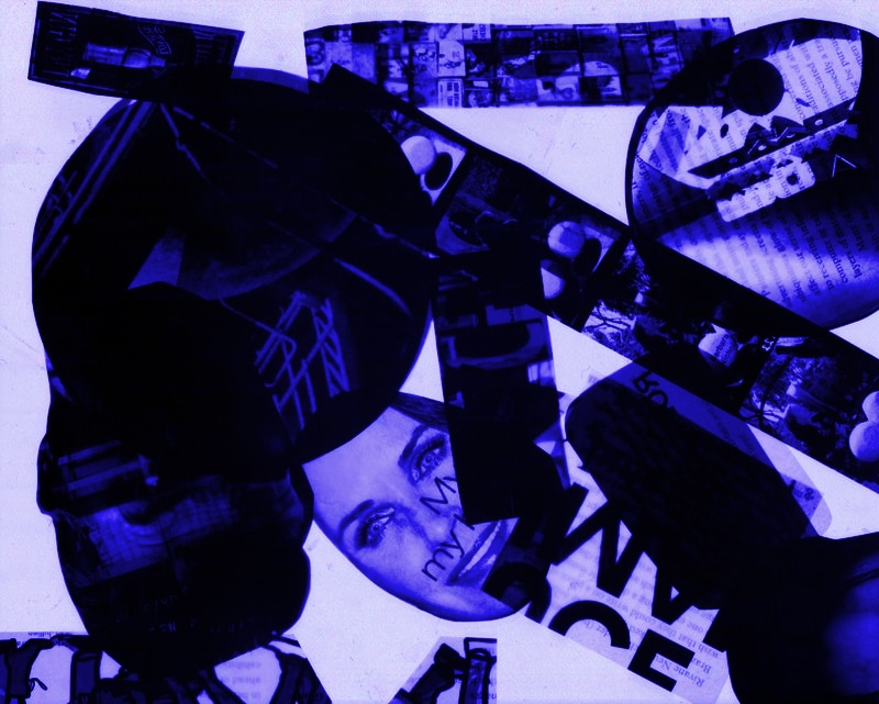
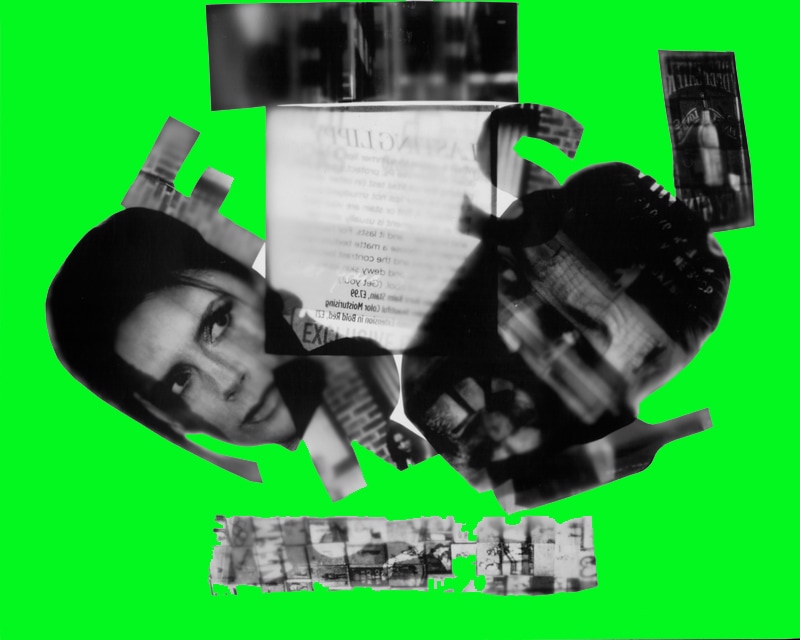
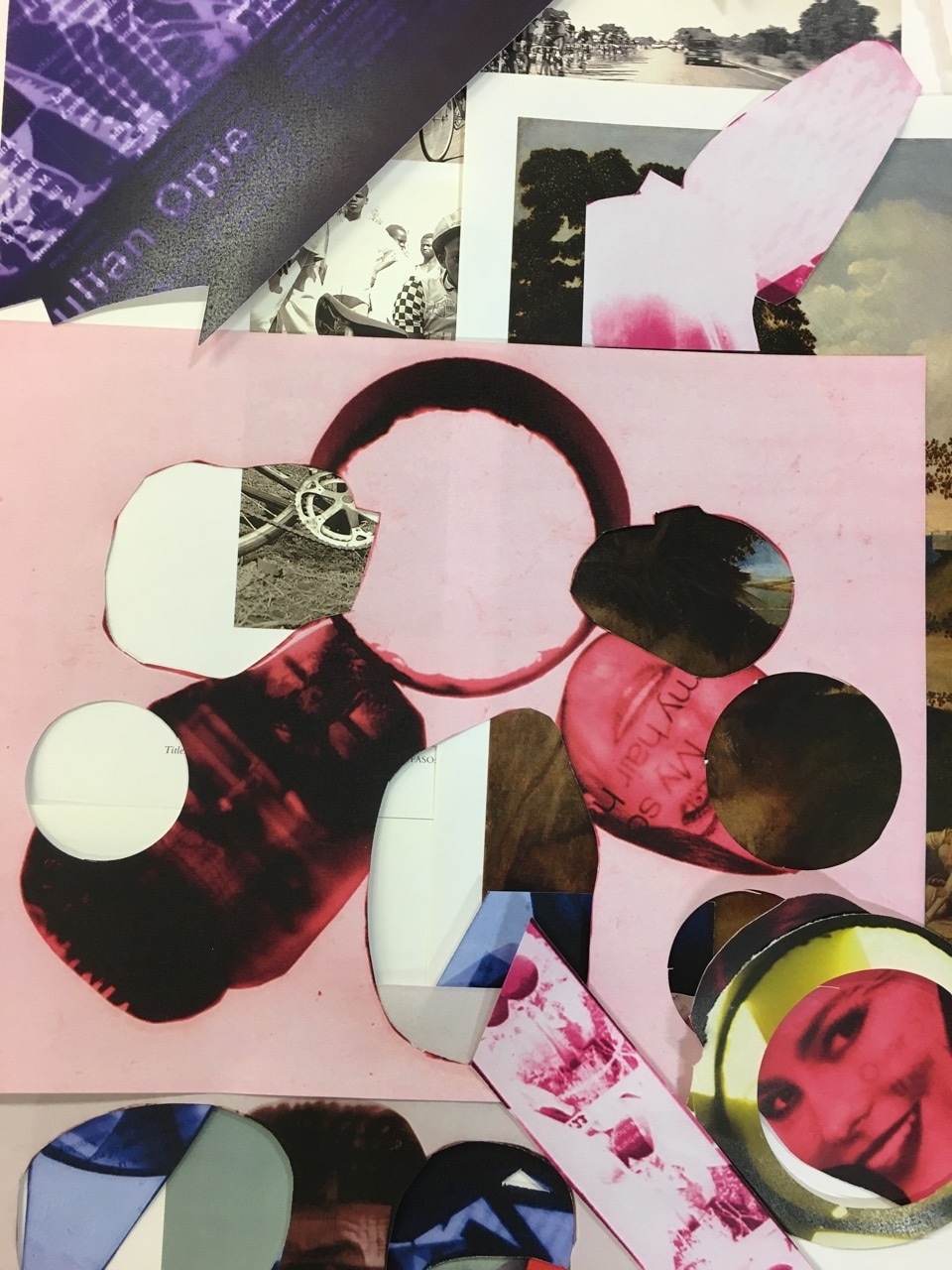
To develop this idea I had decided that I wanted to add colour to my photograms, specifically bold colours to create a 1920's look. I done this by putting all of my photograms into photoshop and inverting them as well as rotating. I then added new layers to all of them and chose colours that caught my eye. Then I applied the colour through overlaying. For some of the images I added colour to the background but for the others I added colour into the main subjective areas for a variety.

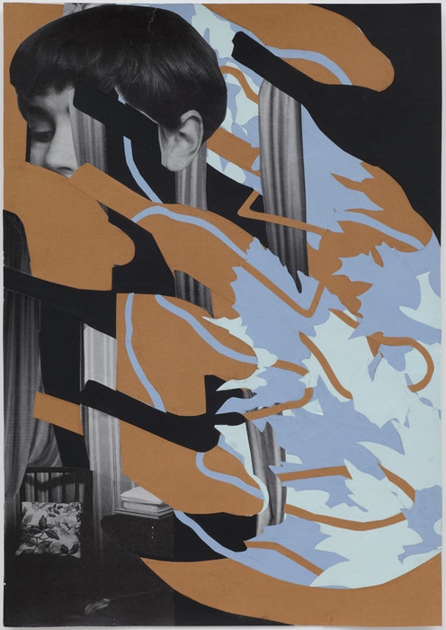
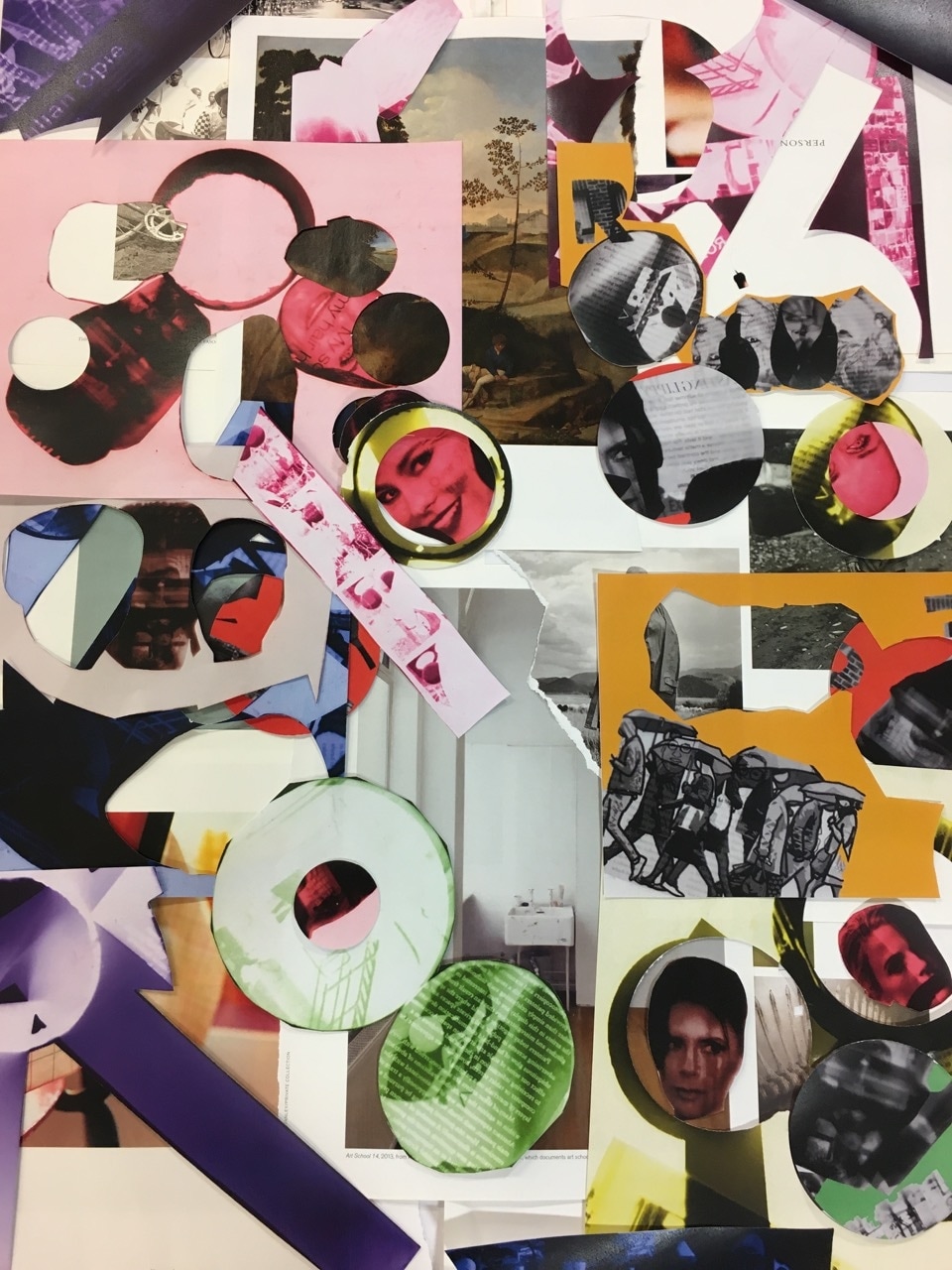
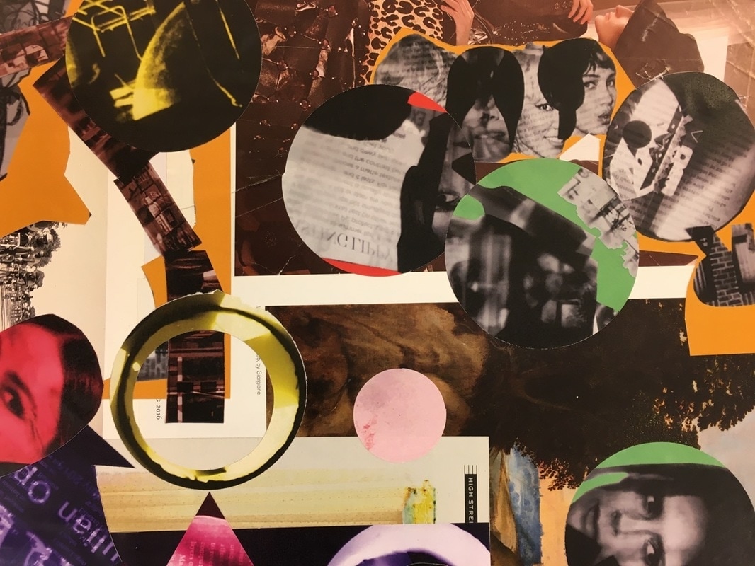
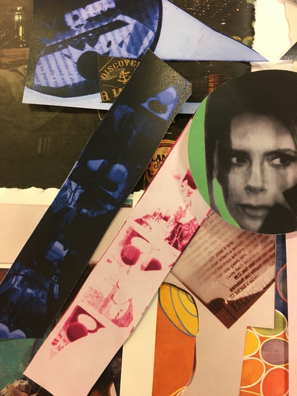
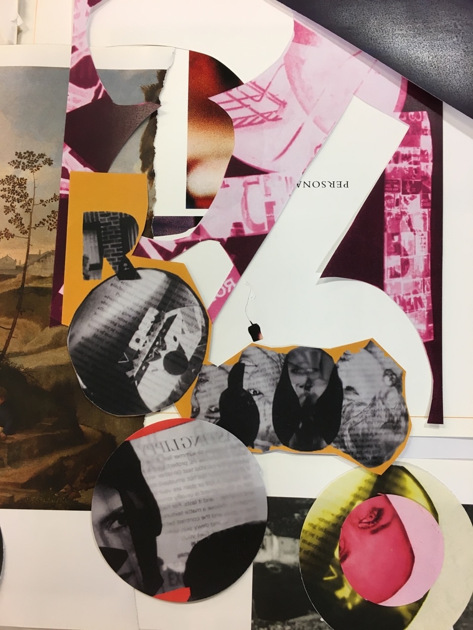
Final Outcomes
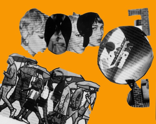
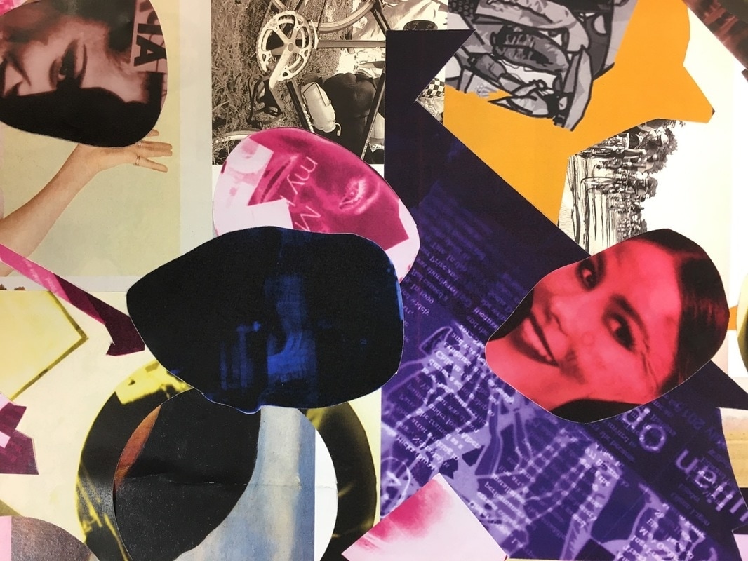
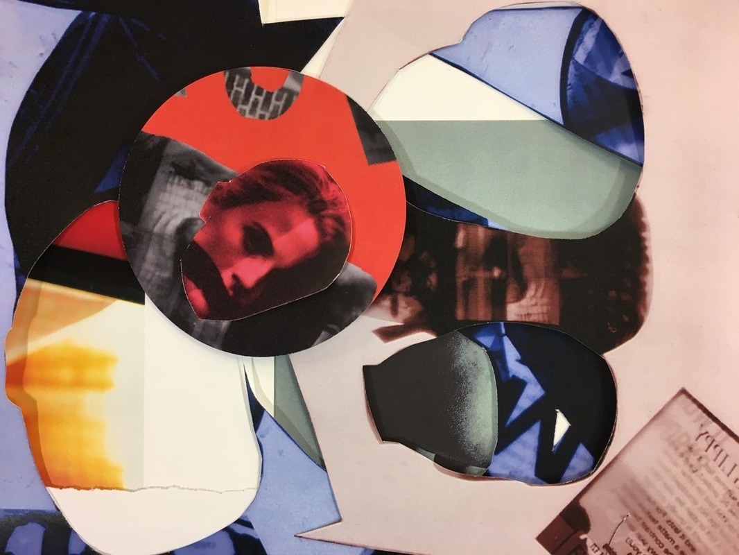
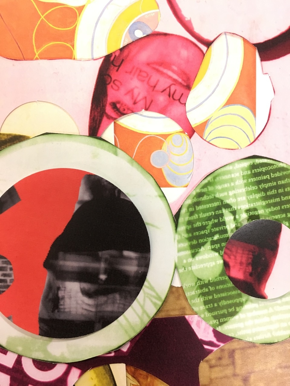
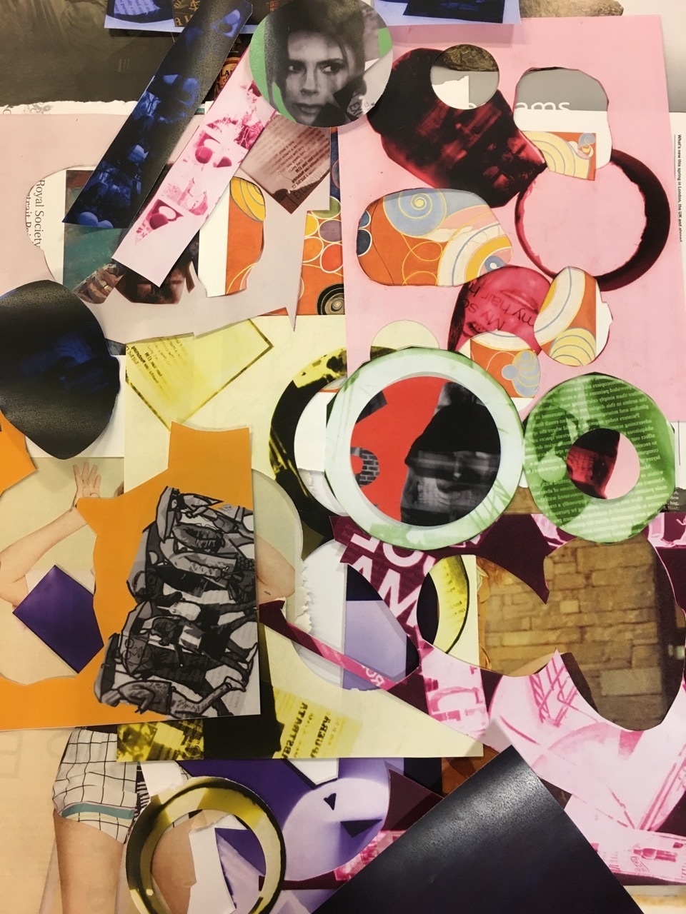
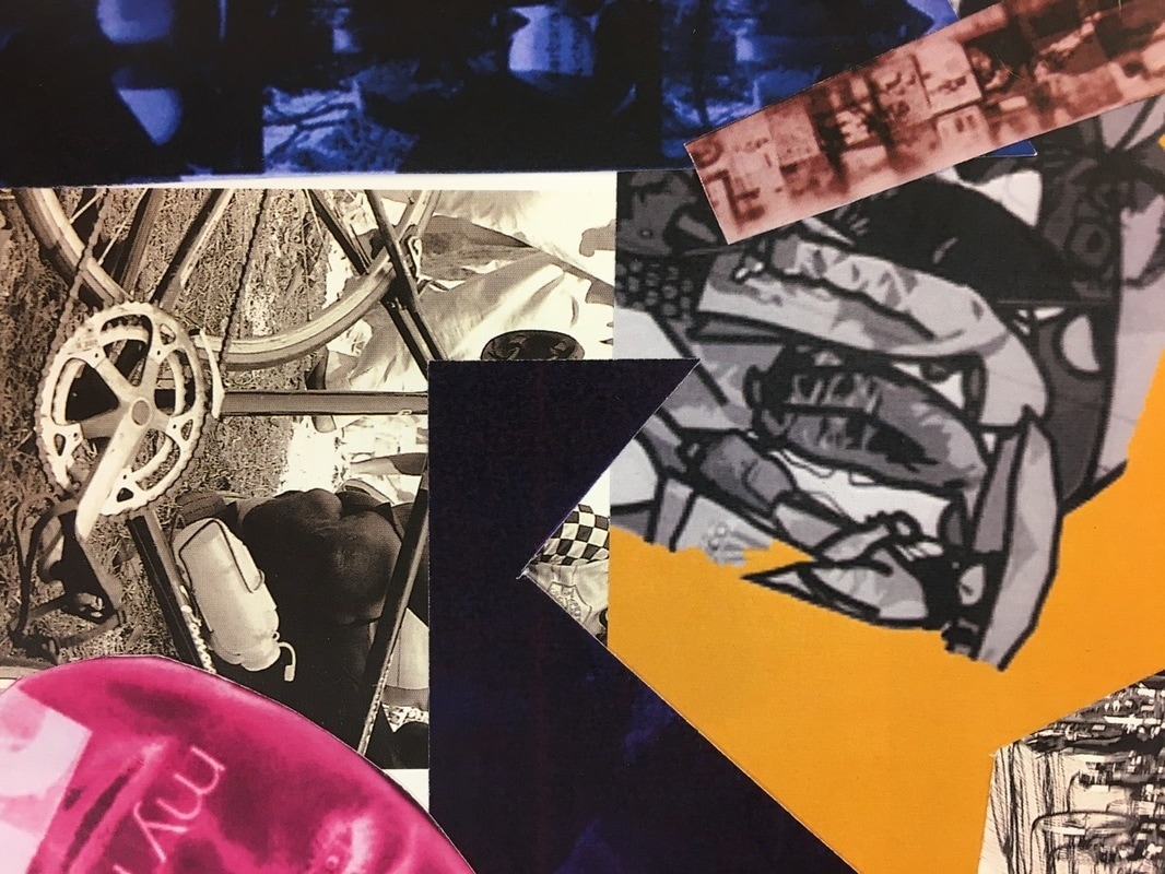
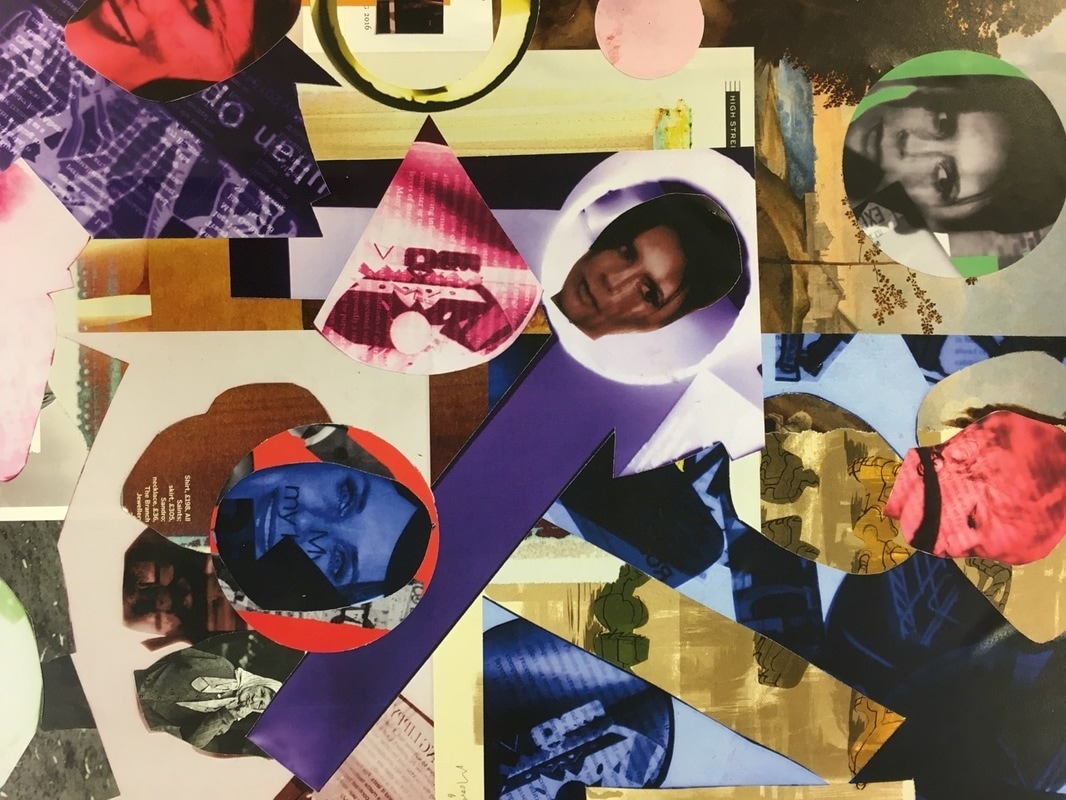
To develop my idea even further I printed out my coloured photograms. I then experimented by cutting out different shapes. My intensions were not to make perfect shapes, I wanted to create very abstract cut outs. However I did also use a circle cutter to create perfect circles because I wanted the mixture of abstract and geometric shapes. As well as using the cut outs I also used the pieces left over as they made distinctive lines and edges. After cutting I then decided I wanted to use pages from different artistic books, I didn't want straight edges because I wanted it to look hand made. After layering that onto paper I played around with the cut outs by placing them in different places to see which worked best. I tried to cover as much white space as possible whilst doing this to create a bold montage look. I repeated this step a few times to see which one was my favourite and whilst doing this I took photos of sections. Some of them are closer to the surface area and others not so close so you are able to see the whole montage. Doing this created many amazing images as every part of the montage had different lines, edges and patterns.
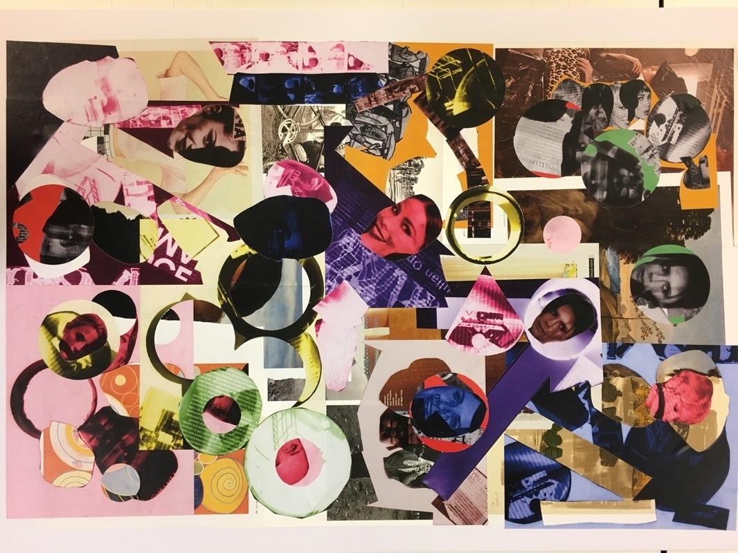
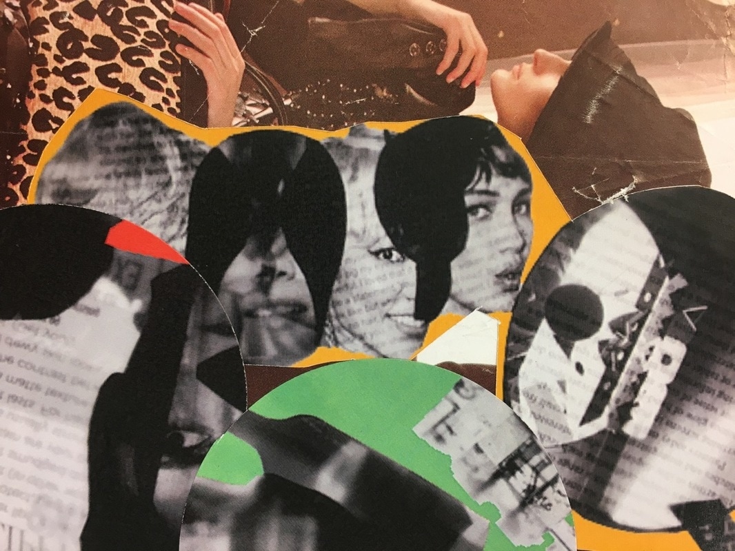
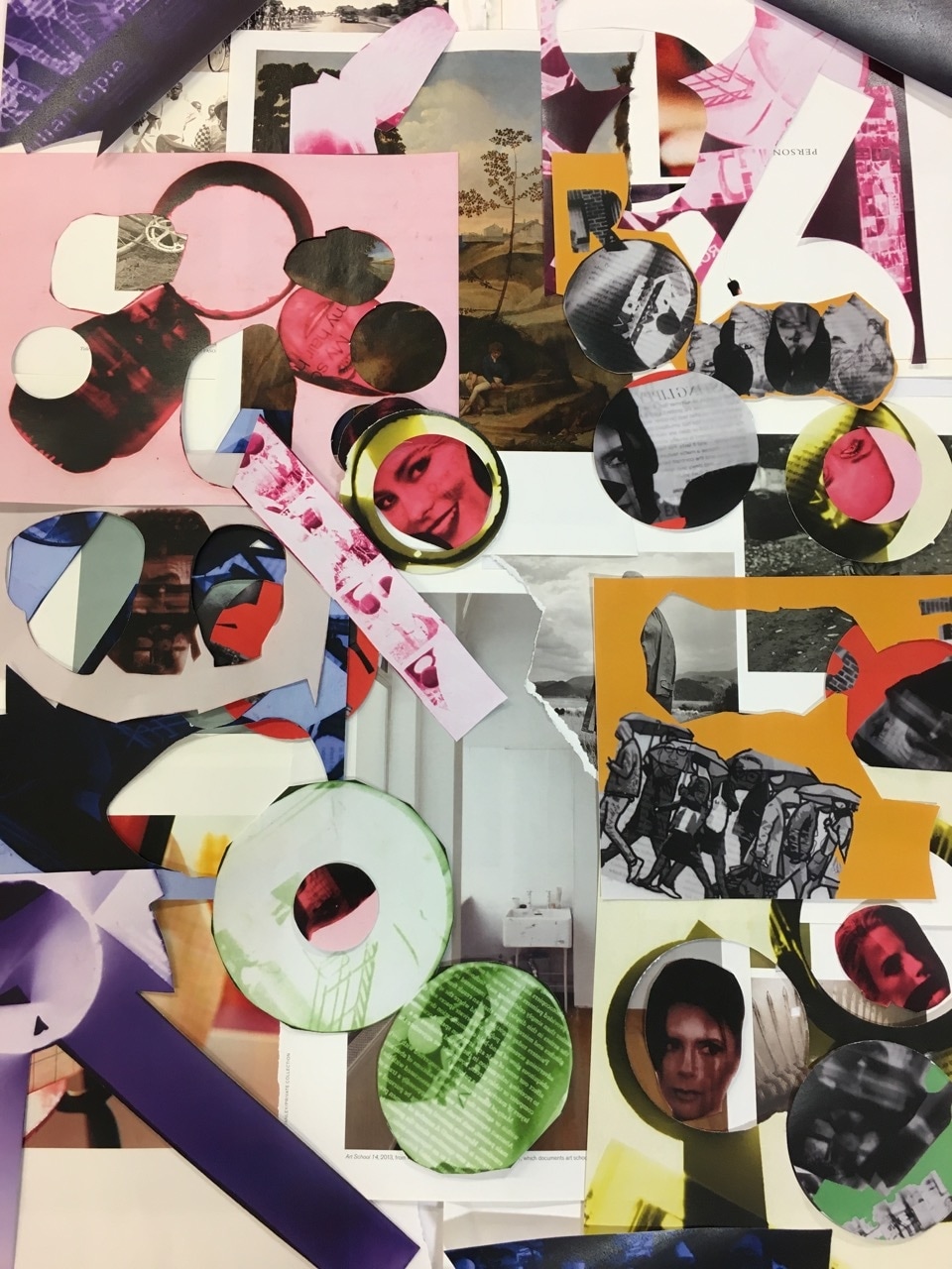
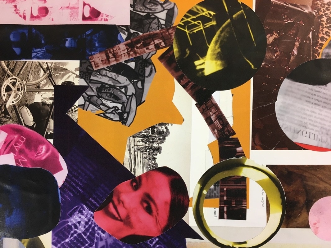
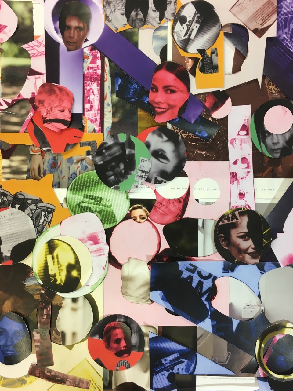
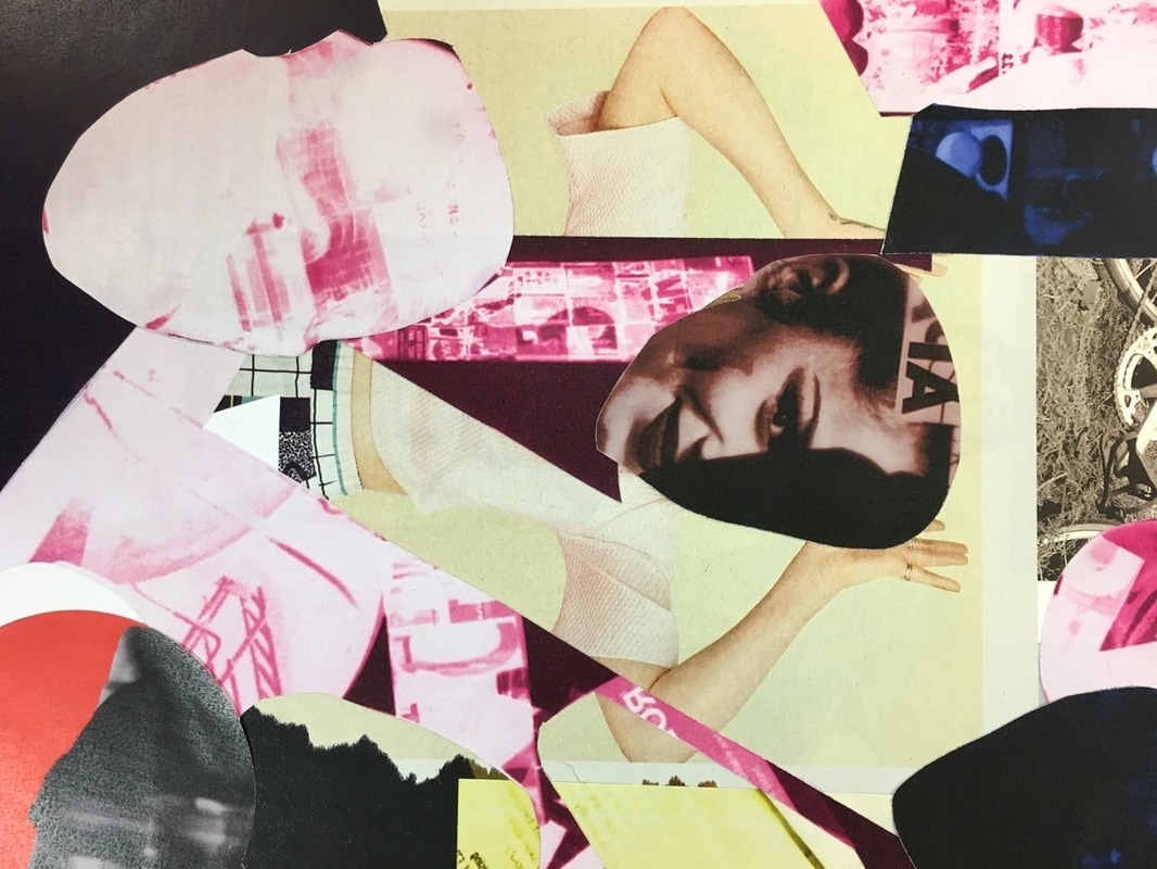
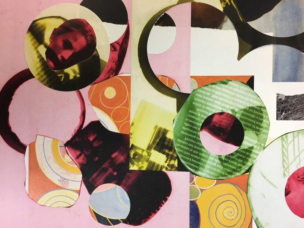
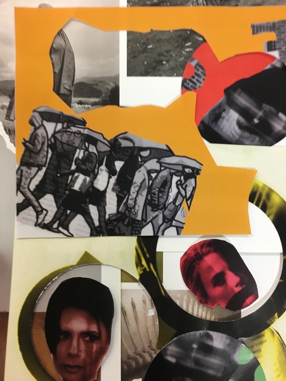
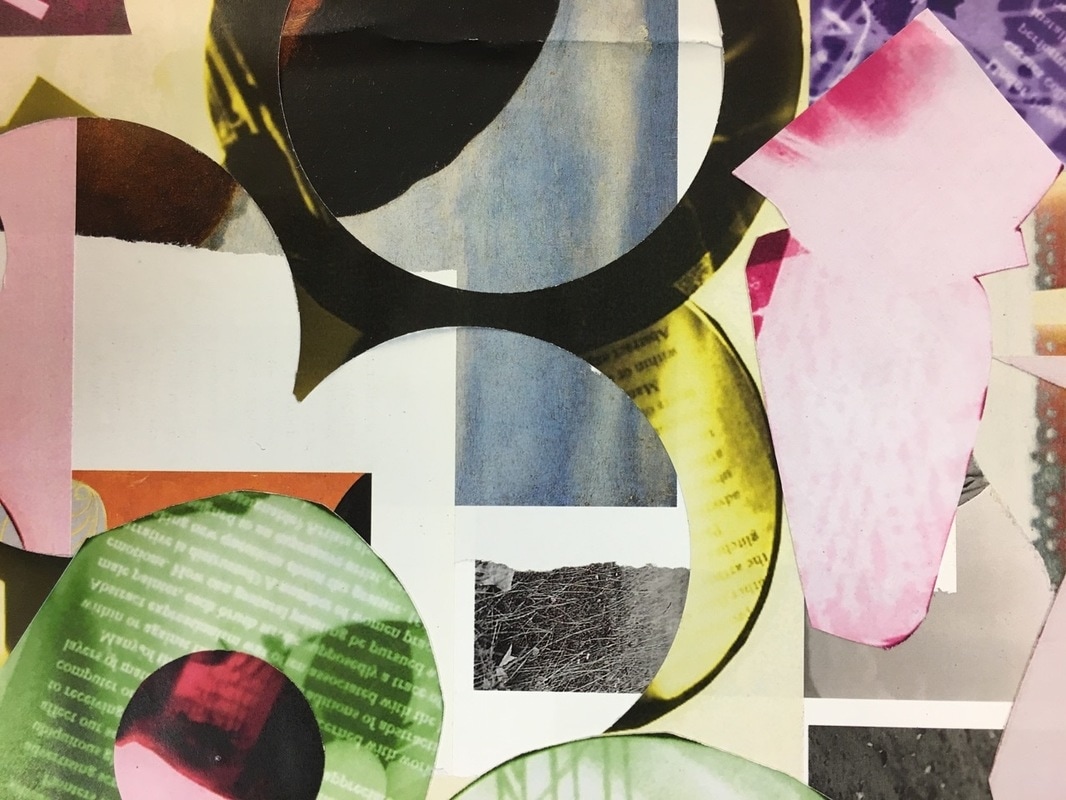
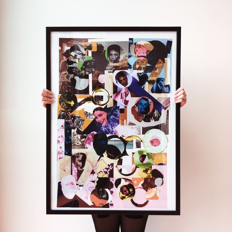
Completed Final Piece/ Evaluation
For Unit 2 I chose detail as my theme because you can take this theme and interpret it in any way you wish. There are many different ways you can explore and display this theme due to its varied aspects. I also felt there would be many techniques I could explore with throughout, in order to see which one works best for my final piece.
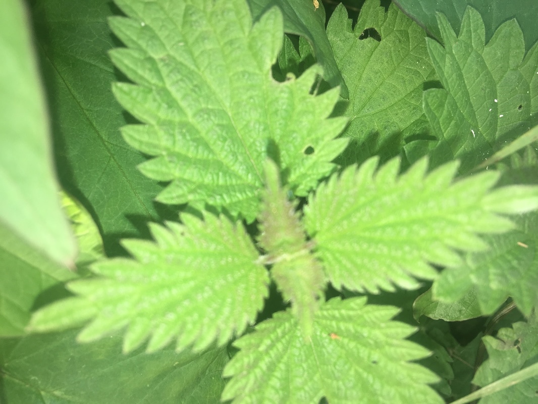
At first, using Jo Whaley and Henry Troup for inspiration I explored different surface backgrounds to remind me of the different textures and tones we see in our day to day lives. This included outside surfaces as well as indoor surfaces. I done this by experimenting with different use of light and viewpoints. I created some interesting abstract images doing this. However next time I would like to develop these images even further by changing them from colour to black and white as well as increasing the contrast. I also created images by using a lightbox. This worked well to some extent as I managed to try out different camera angles. However next time I would like to use some different elements, for example flowers, branches and leaves.
For Unit 2 I was inspired by many artists, which include Henry Troup, Jo Whaley and Linder. However my main inspiration was focused on Eduardo Paolozzi. From the beginning I knew I wanted to create some of my own photograms. So I done this by using cut outs from a magazine in order to make some effective negatives. I then developed my idea by placing my images into photoshop and adding colour. I added vibrant, bold colours in order to create a pop art effect just like Paolozzi did. This worked well as I was able to play around with the photoshop tools to see which look worked best for my idea. However next time to improve I would like to add shapes and lines onto the images using photoshop to make the images even more abstract.
Throughout this project I have used photoshop, used the dark room and I have used the light box. The project has allowed me to explore different techniques and how I could produce images in original ways. At the beginning I thought it would be easy to interpret the theme. However I have in counted many difficulties. Despite this, my final piece was generated from the research and experimentation that I carried out. My research provided me with different perspectives and aspects of the theme detail and experimenting allowed me to explore different ways I could present my ideas. Overall my final piece is a personal response because it has come from my interpretation of the research I have done and I think I have been successful exploring detail to some extent.
